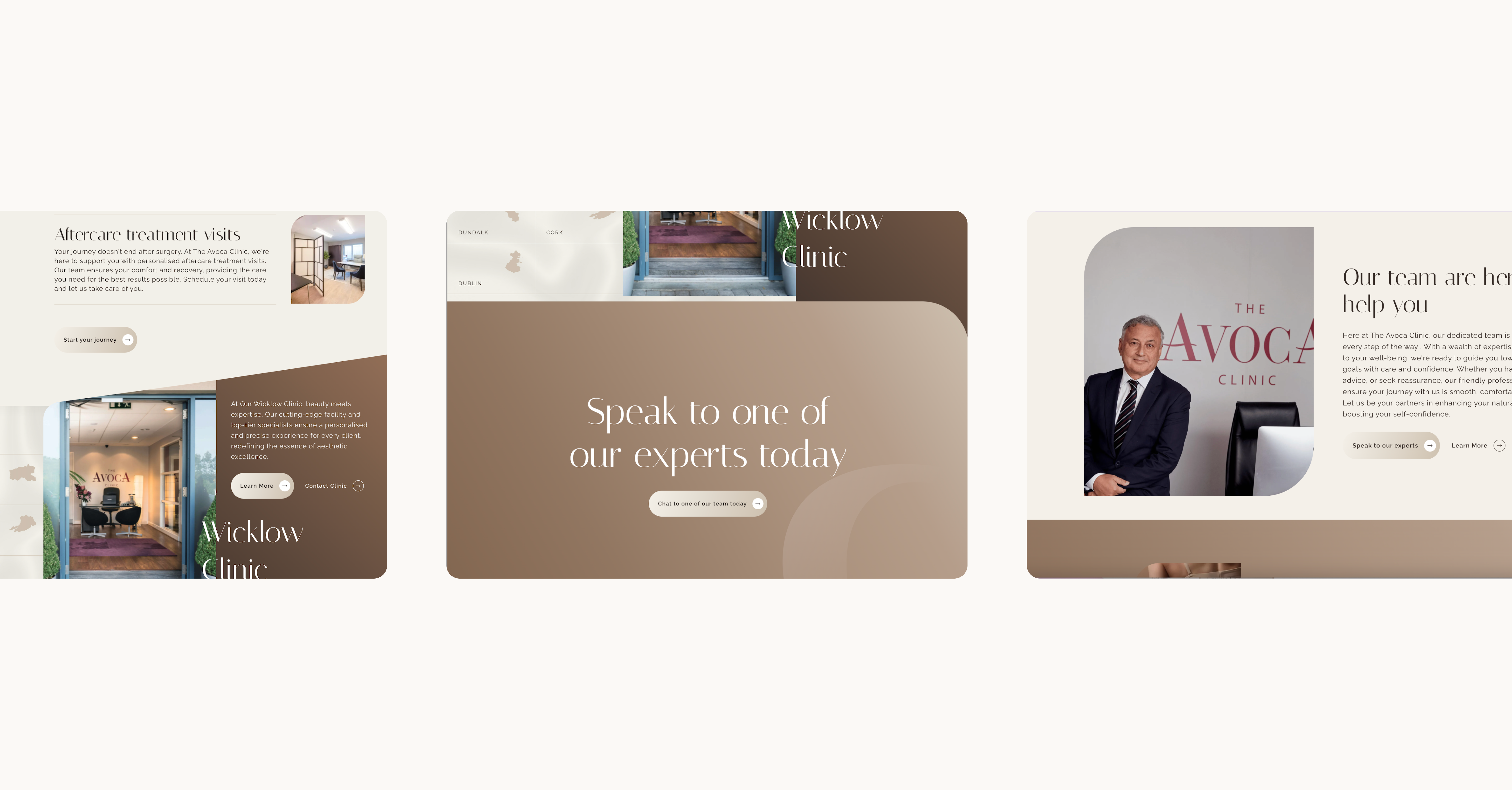
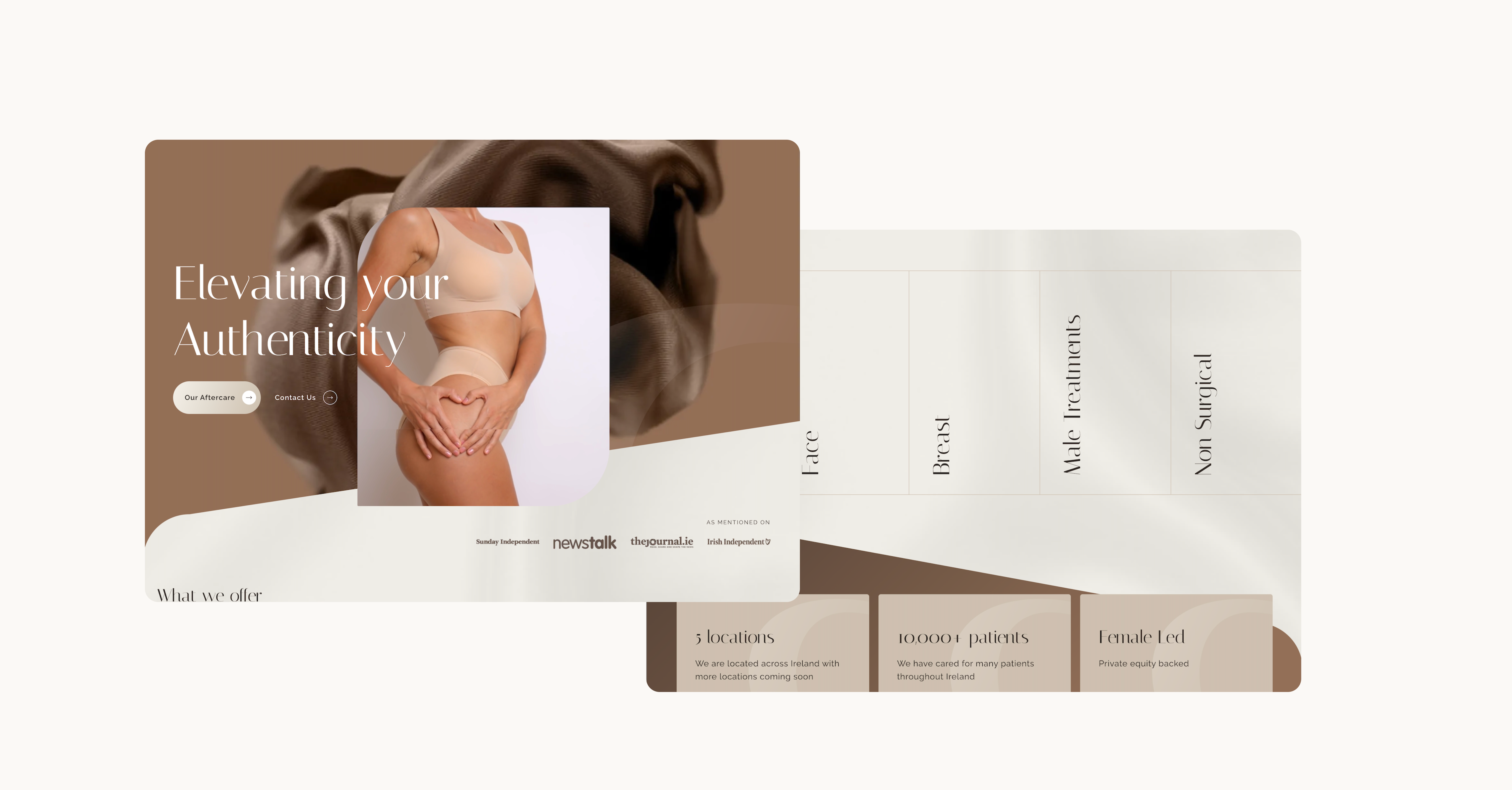
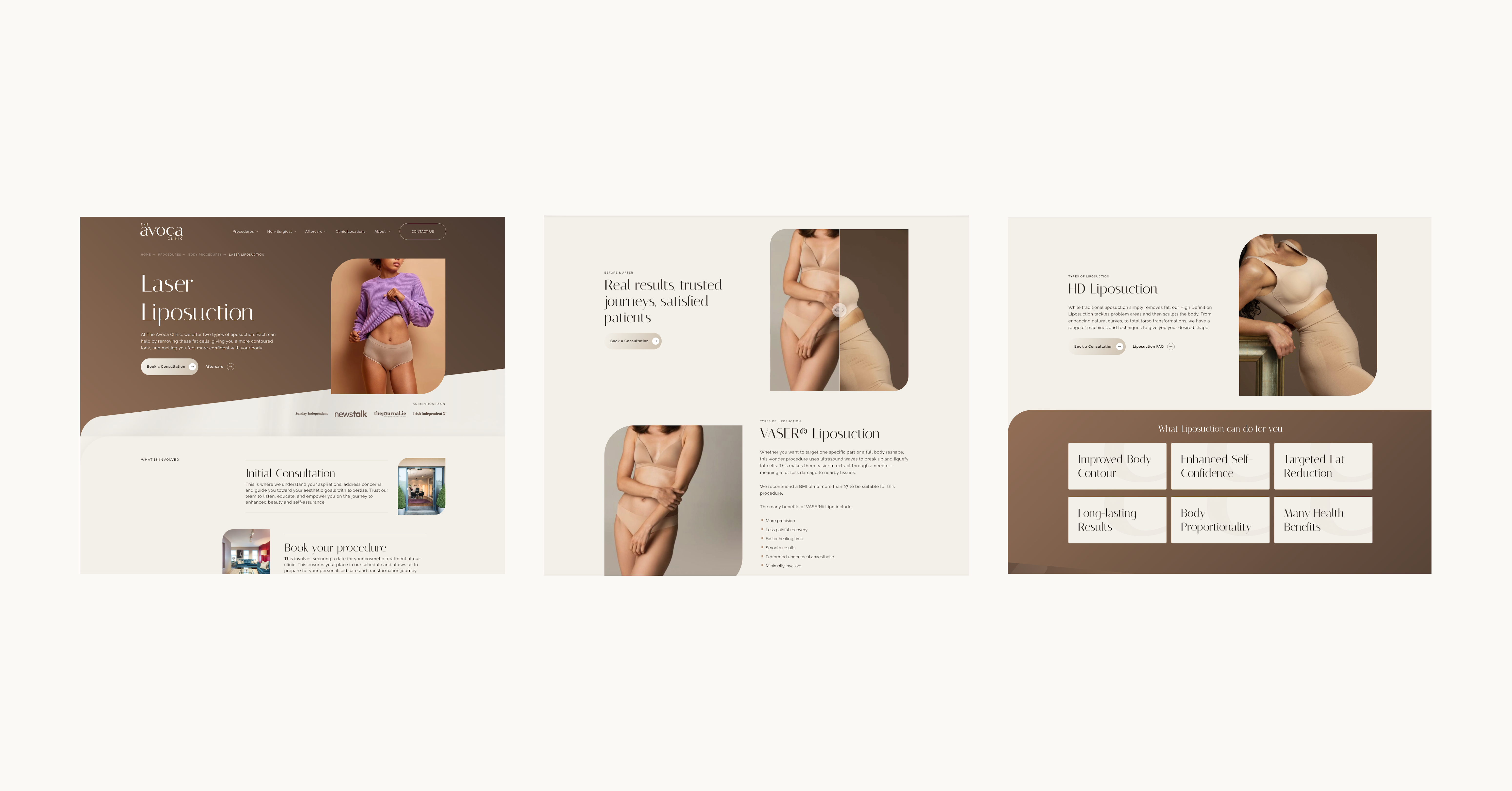
Overview
Targeting business growth
In November 2023, The Avoca Clinic reached out to Kooba to engage in a comprehensive website redesign. The Avoca Clinic sought an increase in engagement and leads via a more streamlined user experience (UX) for their visitors, as well as to subtly adjust their brand identity and grow their organic web traffic. Kooba’s data-driven approach identified several crucial areas for improvement, and prioritised a higher conversion rate, a mobile-friendly approach, and a thoughtful visual brand. Through enacting these changes, The Avoca Clinic saw an increased conversion rate, greater site traffic, and ultimately an improved volume of valuable leads.
View the site
avocaclinic.ieIncrease in visit duration
Increase in engagement time

Boosting lead generation
From the outset, The Avoca Clinic identified lead generation as a key objective of their website redesign. Kooba’s UX team recommended integrating lead-generating call-to-actions (CTAs) throughout the navigation bar and homepage to encourage conversions. These strategically placed CTAs on the site delivered a significant increase in click-through rates and session durations. The homepage, for instance, saw a 49% increase in views per session, a great indication of stronger engagement. The effective use of CTAs throughout The Avoca Clinic’s site translated to an uptick in lead generation, helping to surpass key performance indicators (KPIs) set during the project.
Putting mobile first
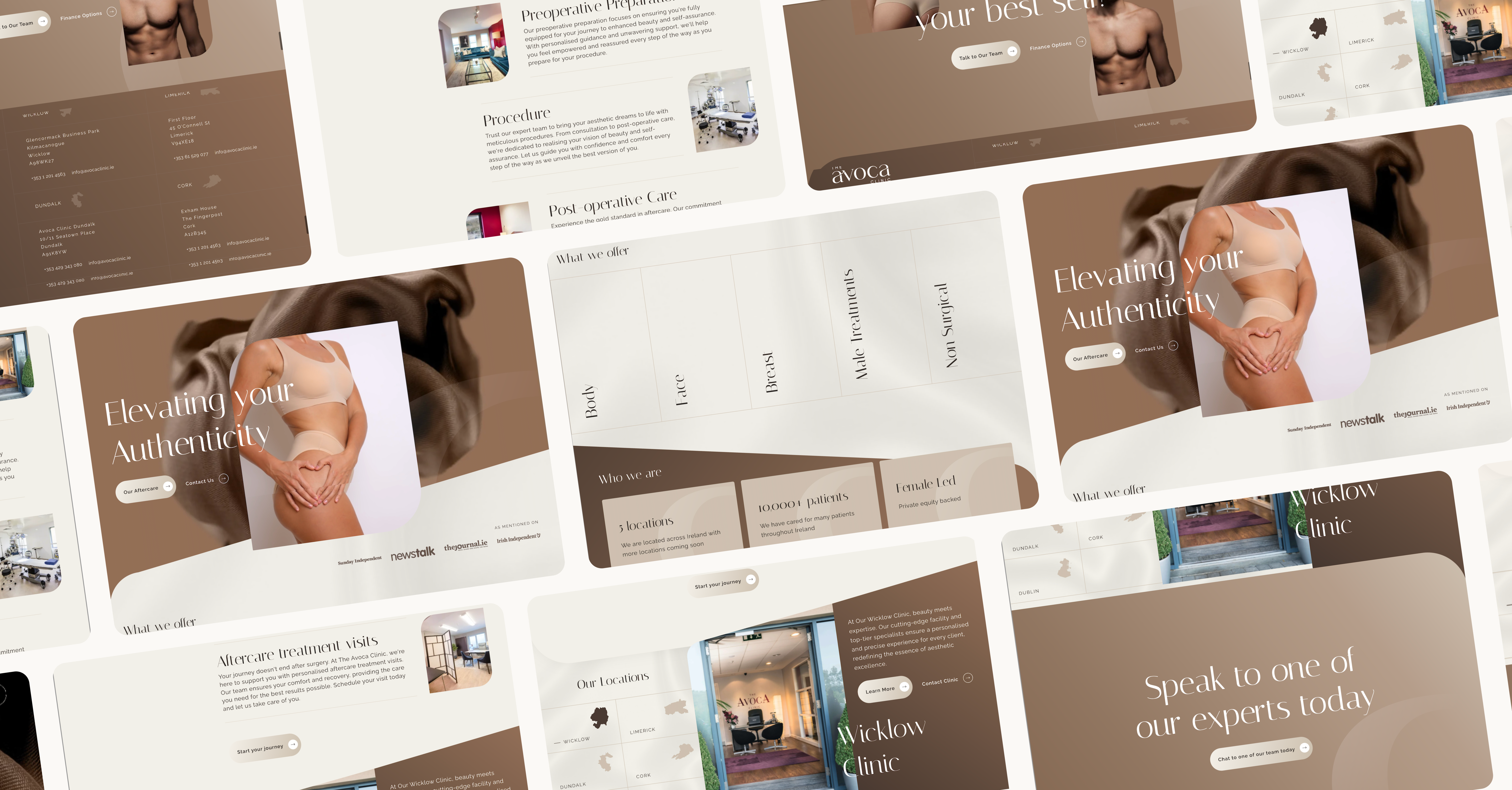
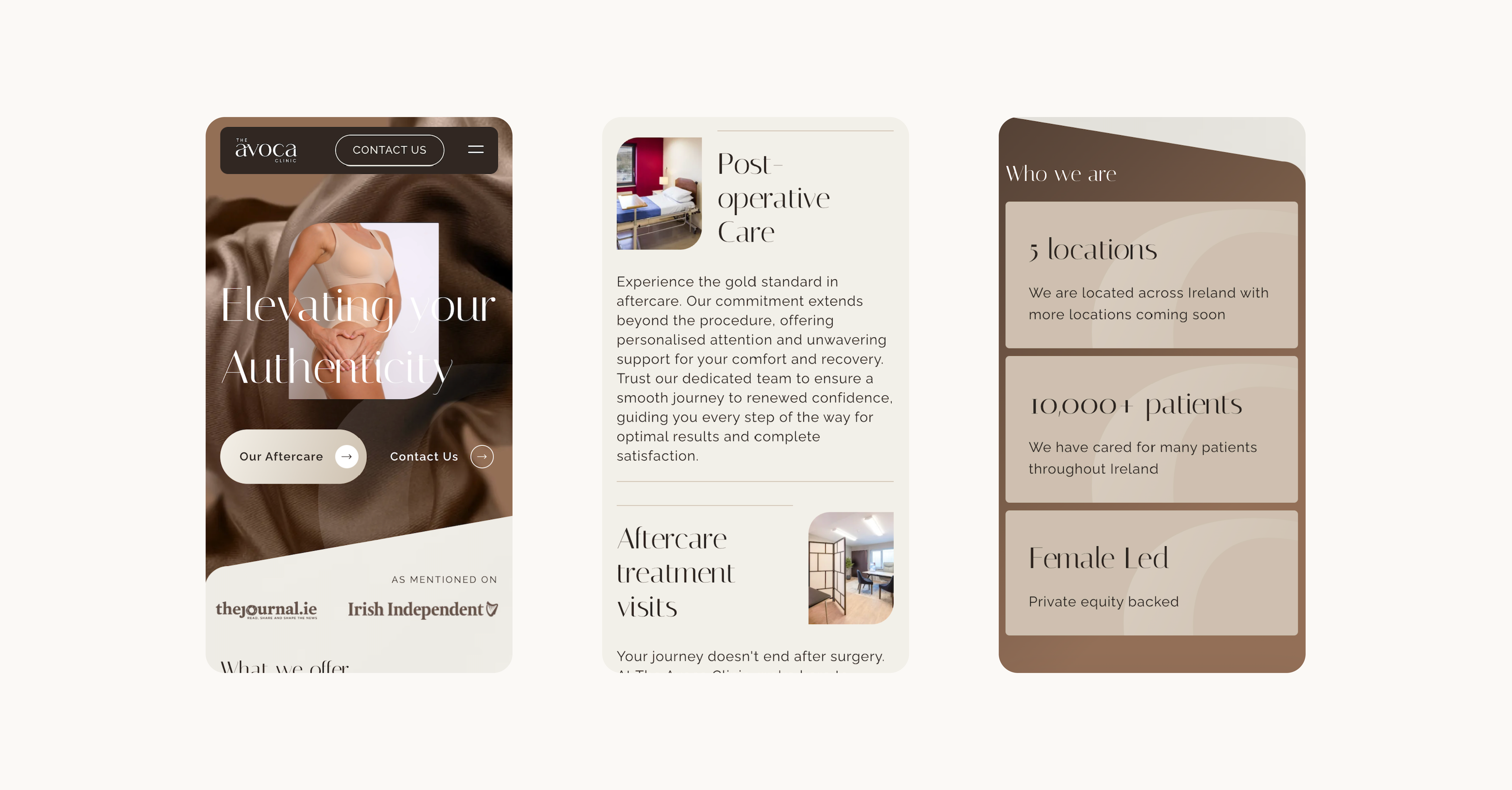
During Kooba’s initial UX audit, our team discovered that over 88% of The Avoca Clinic's website traffic came via mobile devices. On average, mobile users also generated higher engagement and conversion metrics. With this in mind, Kooba focused on a mobile-first design strategy and streamlined the navigation system specifically for mobile interfaces. In the process, mobile loading times and performance metrics were optimised, improving SEO rankings. This approach was reinforced by the inclusion of a WhatsApp contact feature, making conversion even easier for mobile users. Since building a fully responsive, mobile-first site, Kooba has seen the proportion of mobile users increase to over 90%, contributing directly to an increase in engagement and inbound leads.

Building a brand
Alongside an improved UX and the accomplishment of KPIs, The Avoca Clinic sought to subtly reposition their visual branding in order to attract a more diverse range of customers. Kooba’s digital redesign therefore aimed to move toward a more inclusive and thoughtful user interface (UI). This visual shift was intended to accommodate a broader audience whilst upholding an overall professional aesthetic. With clean layouts, a warm colour palette, and the inclusion of patient testimonials, each guest now receives a valuable glimpse into the guest experience. An upgraded UI has resulted in a more attractive and welcoming website, generating organic traffic and feeding back into successful business outcomes.
What we did
- UI / UX design and development
- Information architecture
- CMS integration
- SEO analysis and implementation
The result
Generating a return on investment
The Avoca Clinic’s website redesign proved successful across every objective. By providing a mobile-first approach, enhancing lead generation CTAs, and displaying a more inclusive UI, the finished website experiences greater traffic and better engages visitors. Across the website, engagement time has increased by 52%, and visit duration has increased by 14%. This suggests that customers are spending more time viewing and engaging with the Avoca Clinic’s content, and are more likely to convert to leads over time. By accomplishing higher leads, sales, and revenue, The Avoca Clinic has enjoyed an excellent return on their digital investment.


