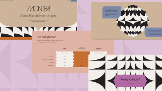
Colour is a little detail that matters a lot. When we experience brands, it is colour, more than anything else, that makes the first impression, and stays longest in our memories. With this in mind, we thought we’d highlight our strategic use of colour in some different branding and web design projects. As a digital agency, we don’t always select the brand colours of our clients (although we can certainly do this!), but we always deploy colour in the most effective and appealing way across our websites. Here’s some examples of exactly that:
SETU
For SETU the use of yellow makes a lot of sense. It denotes warmth, friendliness and positivity, all things that an educational institution wants to provide to its students and staff. To be clear, Kooba didn’t design SETU’s brand, but we did decide to emphasise this colour across their website solution. Several considerations encouraged us to make this decision. Firstly, we understood the importance of SETU’s website as a tool for attracting undergraduates, and hence the value of a friendly and welcoming colour palette. Secondly, SETUs website was built to an AA WCAG accessibility standard, and the use of a light, high contrast yellow served to improve the readability and accessibility of the site’s features. Kooba therefore made the most of SETU’s existing brand identity, further elevating previous design choices through the strategic implementation of an effective palette across SETU’s digital platforms.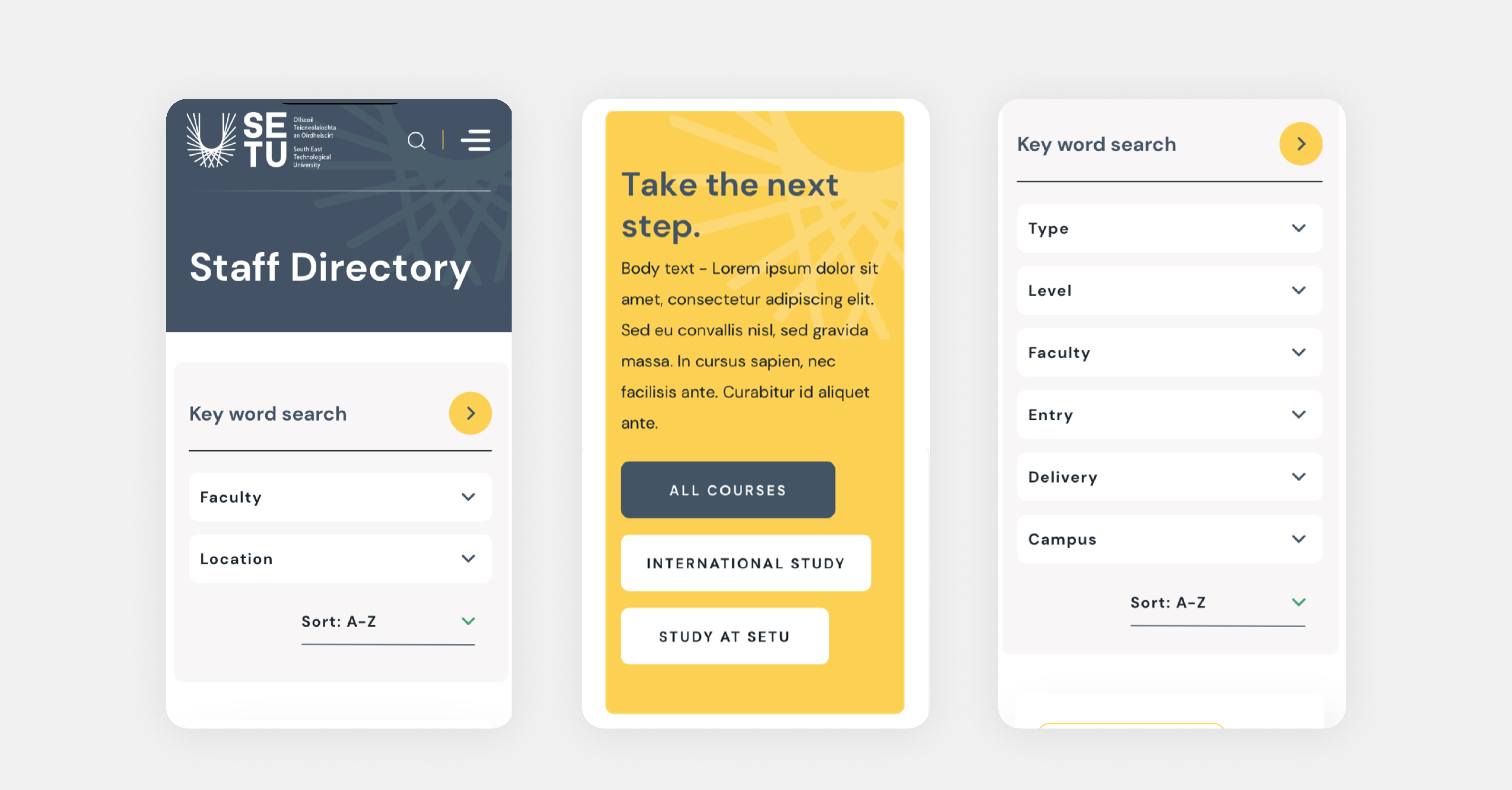
TitanHQ
As cybersecurity industry-leaders, TitanHQ need to constantly communicate their expertise and the trustworthiness of their technology. The choice of a light blue makes perfect sense in this context, with a sense of cool, composed professionalism conveyed to anyone interacting with the TitanHQ brand. During the course of our design process with TitanHQ, Kooba decided to emphasise this tone as much as possible. The backgrounds of the site were filled with gradients of the brand colour, fully immersing the user in the messaging of the company. With a cohesive palette developed, Kooba then used contrasting colours to add interest in strategic areas. TitanHQ had developed unique colour identities for each of their products, and these were thoughtfully incorporated into the site by Kooba, providing valuable differentiation between the range of options available to users.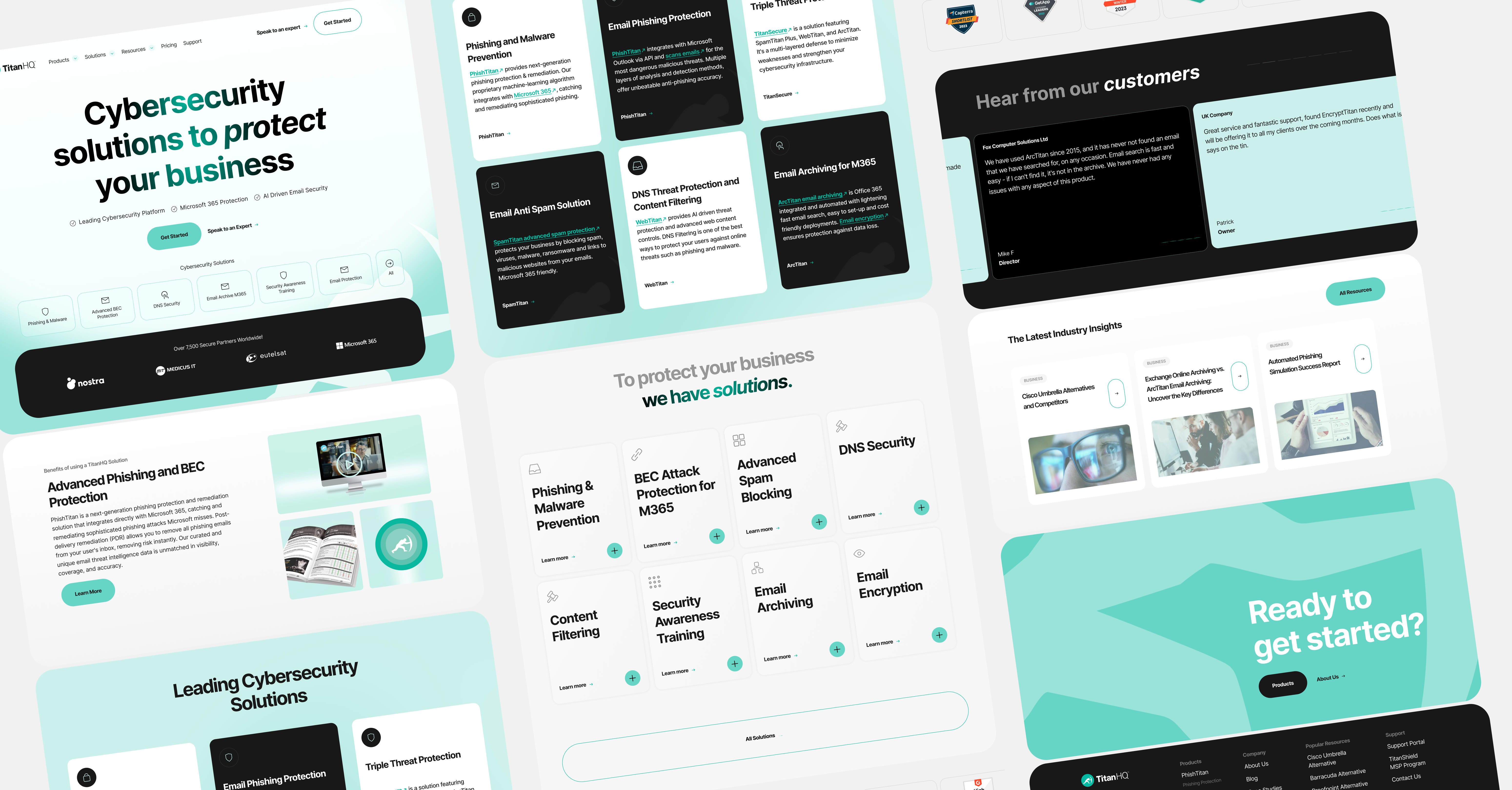
ReproMed
ReproMed approached Kooba with a unique challenge. As a leading fertility treatment centre, they needed to illustrate the patient experience in a warm, welcoming manner. Kooba decided to emphasise the purple tone of their brand towards this end, combining it with a soft palette of beige and pink. The end result was a website that seemed natural, approachable, and prestigious, with the use of purple signalling the high status of ReproMed’s care. This gorgeous colour palette was further reinforced by the incorporation of interactive elements across the site, with buttons and panels changing colour when hovered over. The final UI is therefore truly enjoyable to view, and invites users to delve deeper into the site.
GH Research
Kooba’s work with GH Research began with a comprehensive rebrand. This started with the development of a colour palette, which was built around a soft green tone, emphasising health and cautious growth. This primary colour was contrasted with secondary shades of blue and red, ensuring that chosen pieces of content could “pop” in different designs. The overall impression left by the palette is that of positive change, reassurance, and confidence, all crucial values for a company centred on the provision of innovative therapies. This communication of security and stability was crucial to both assuring new investors as well as recruiting participants for ongoing trials. Kooba approached our branding solution and website design in a holistic manner, and this meant that the colours we selected were perfectly suited to building a beautiful and effective web solution.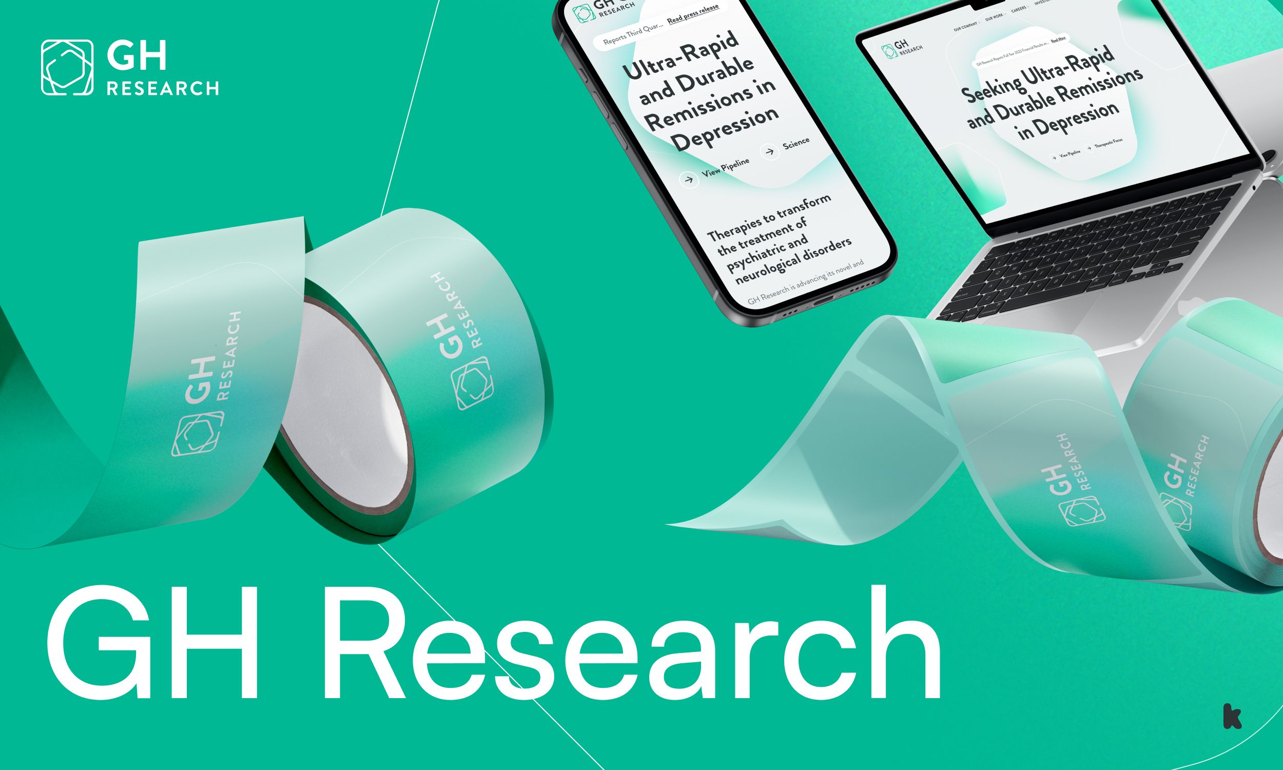
We understand that colour matters, and that’s why our design team devotes so much time to making your colours work for your website. By combining colour with animations, interactions and imagery, your brand identity can be further enhanced and developed by your digital platform.


