We have some exciting things going on at Kooba, one of which is a new site! We’ll share more details on that in the coming weeks, but before we release our new online presence, we wanted to take a moment to relive the evolution of the Kooba site through the years.
To give some background on our agency: Kooba was started in 2005 by Emmet Dunne with a vision to create a new type of digital agency that broke away from traditional agency norms. Part of the ethos at Kooba is being proud to be different, and we take this into our work every day with our approach to cultivating client relationships and allowing data to lead us. Ed Kelly joined Kooba in 2010 as the Creative Director and the dynamic duo of “Emmet and Ed” took flight.
Over the years Emmet and Ed have worked on countless projects and helped clients reach their digital goals. They have brought Kooba from a 3 person agency operating from an office where mittens had to be worn during the winter months to a talented team of 23 (and growing!) with offices in both Dublin and Berlin.
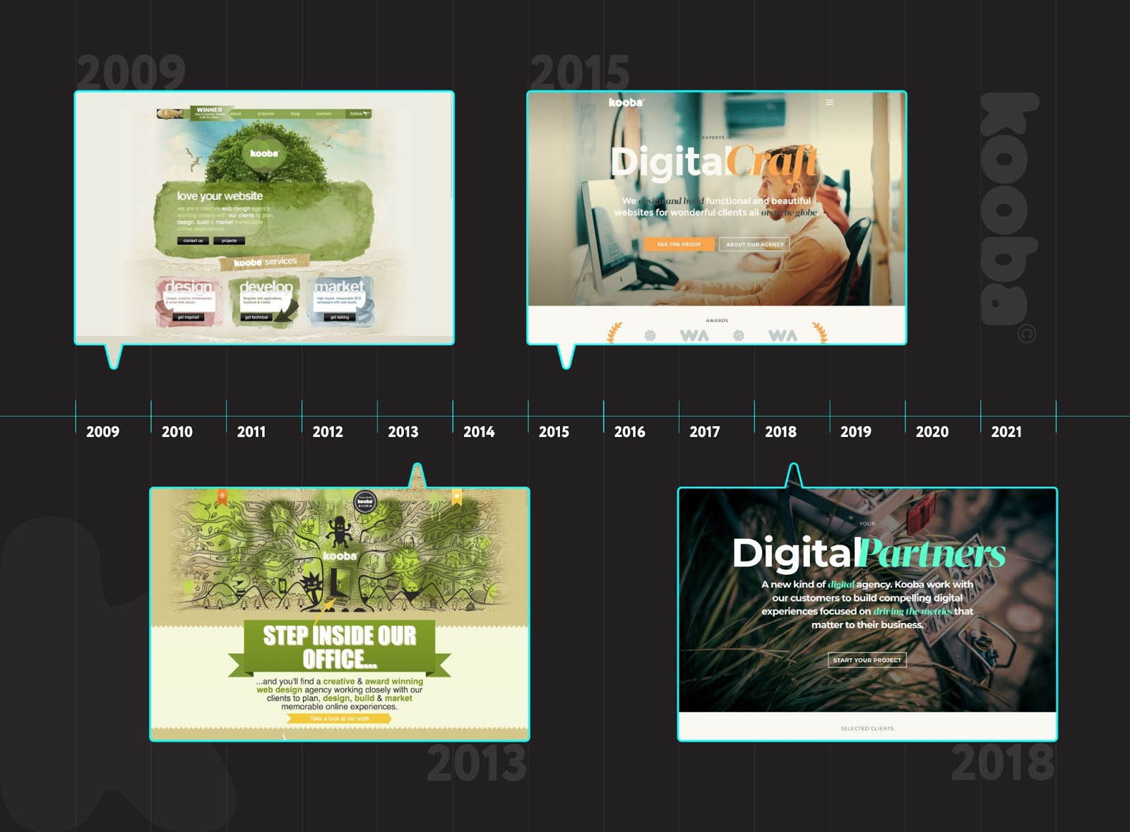
Kooba circa 2009
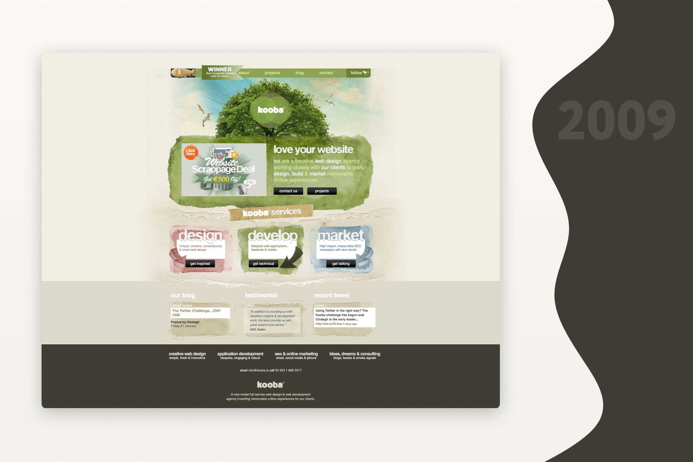
This is one of the earliest versions of the Kooba site. There’s a lot of nostalgia here for the “Kooba Tree” design and the simple, short homepage that told you everything you needed to know about us with one swipe of your mouse. We also encompassed some of the popular design trends of that time including flashing graphics in the banner carousel, rounded-edge boxes and the peeling effect of pages.
Bonus: We even gave our Kooba Tree a dusting of snow for the Christmas season!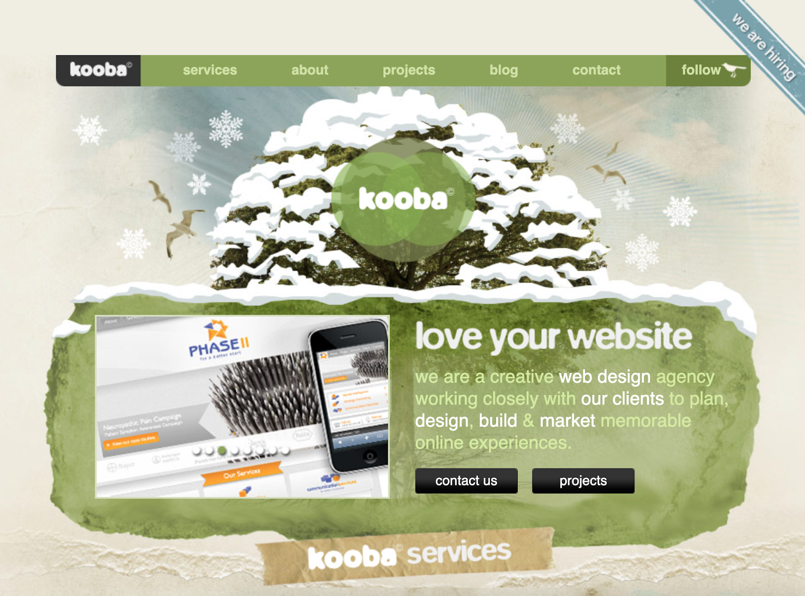
Kooba circa 2013
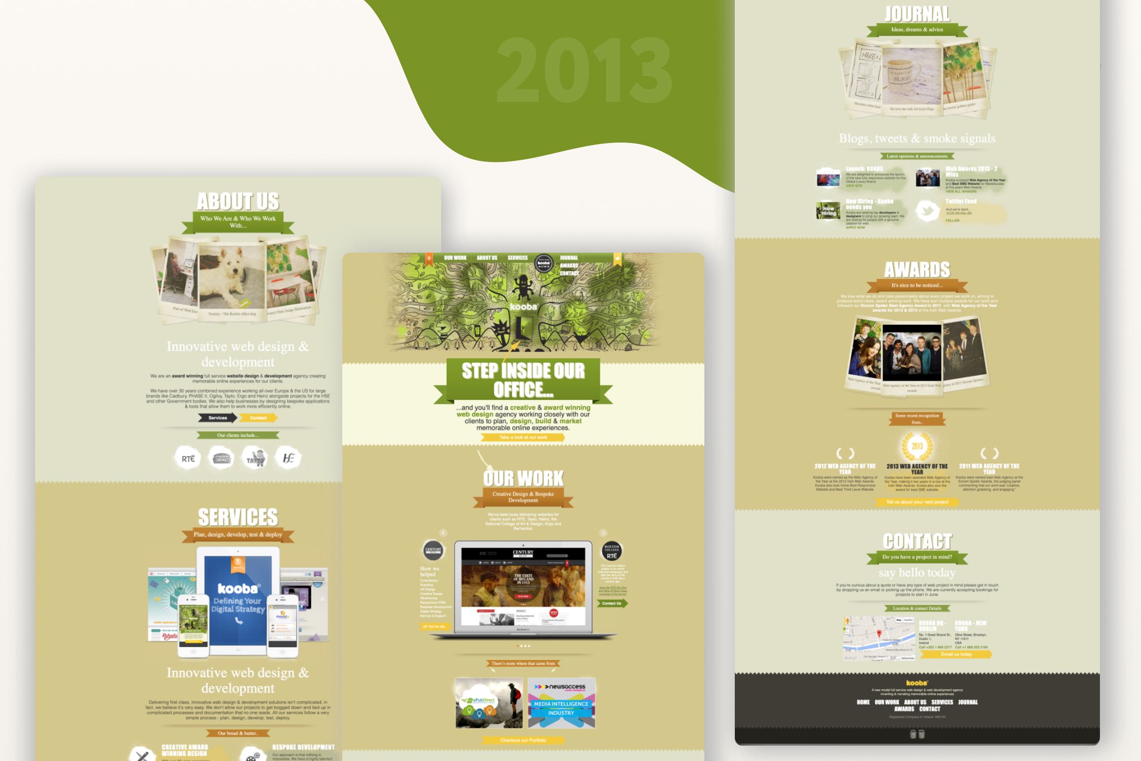
In 2013, we gave our site a facelift and brought a bit more of our personality out through art, Kooba culture photography and animations. The first thing you would have seen when landing on the page is an art piece (which is actually hanging in Kooba H.Q.!) and bold, in-your face messaging. We did away with the rounded edge boxes and lengthened our homepage to include more of our recent work samples and services offered. We also had a bit of fun with polaroid snapshots of office culture and even added tilting animation features. With this version of the site, we included some of the more popular 2010+ web design trends including a huge header image, a slab typeface and more retro design.
Kooba circa 2015
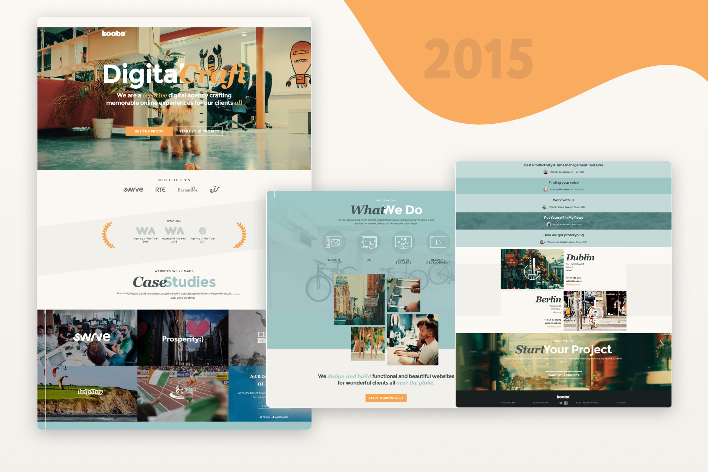
At the beginning of 2015, we decided to do a complete overhaul of not only our site but our branding as well. We did away with the green colour scheme and brought in more white space and orange and blue tones. To keep in line with the more simplistic approach, we shifted to using a takeover and a sticky nav element that would follow you down the page. This style of site hinged on a more professional look rather than our past sites that had been more playful. We also put special focus on our messaging and tone of voice to communicate effectively who we were as an agency and what success meant for us.
Kooba circa 2018
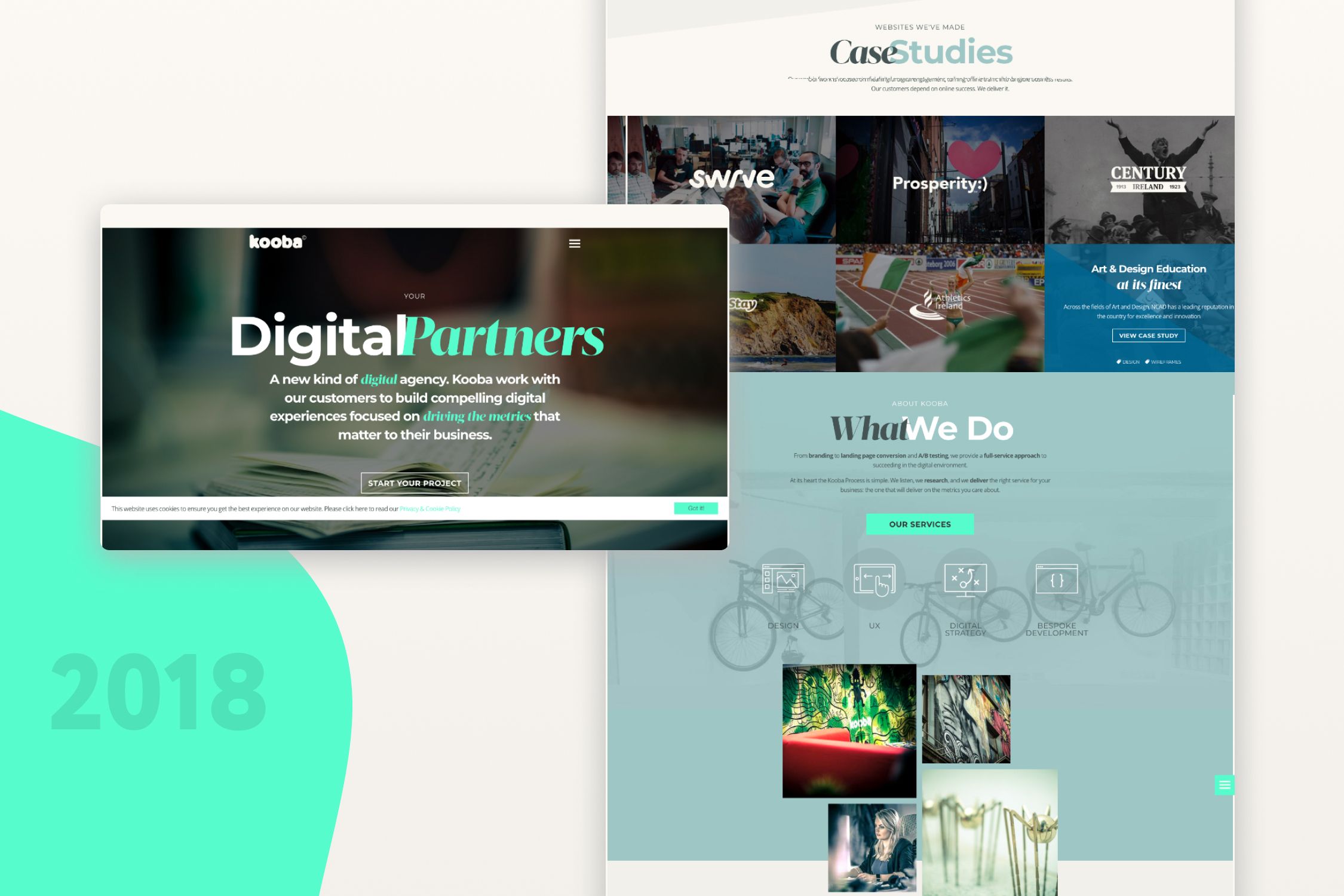
In 2018 the Kooba site transitioned to the site you see today. We again put a huge focus on our consistent messaging and came into our branding of being digital partners for our clients. We chose to utilise our teal colour as our primary brand colour with the orange as our secondary and darker shades a bit more in this version. We worked to build up our case study, services and blog section of the site to ensure we had a strong portfolio available as well as fresh, engaging content.


