For this year’s Mocktober, we did things slightly differently. Instead of websites being designed over the course of the month by individual team members, we assembled six teams and challenged them each to design and build a website in one day. On top of this, each team needed to incorporate an AI powered chatbot to their website. To do this, our developers and copywriters had to learn to use Intercom, a customisable chatbot solution that can be taught to engage with users in a wide variety of ways.
In the end, six brilliant projects were completed, with each taking a different approach to the Halloween theme and the chatbot challenge. Hear from each of the teams below:
Team 1: Zeus-X
https://alan-mocktober.netlify.app/homepage
Design - Josh Sharry
Frontend - Alan Murray
Backend - Fahad Patel
Copy - Evan Farrell
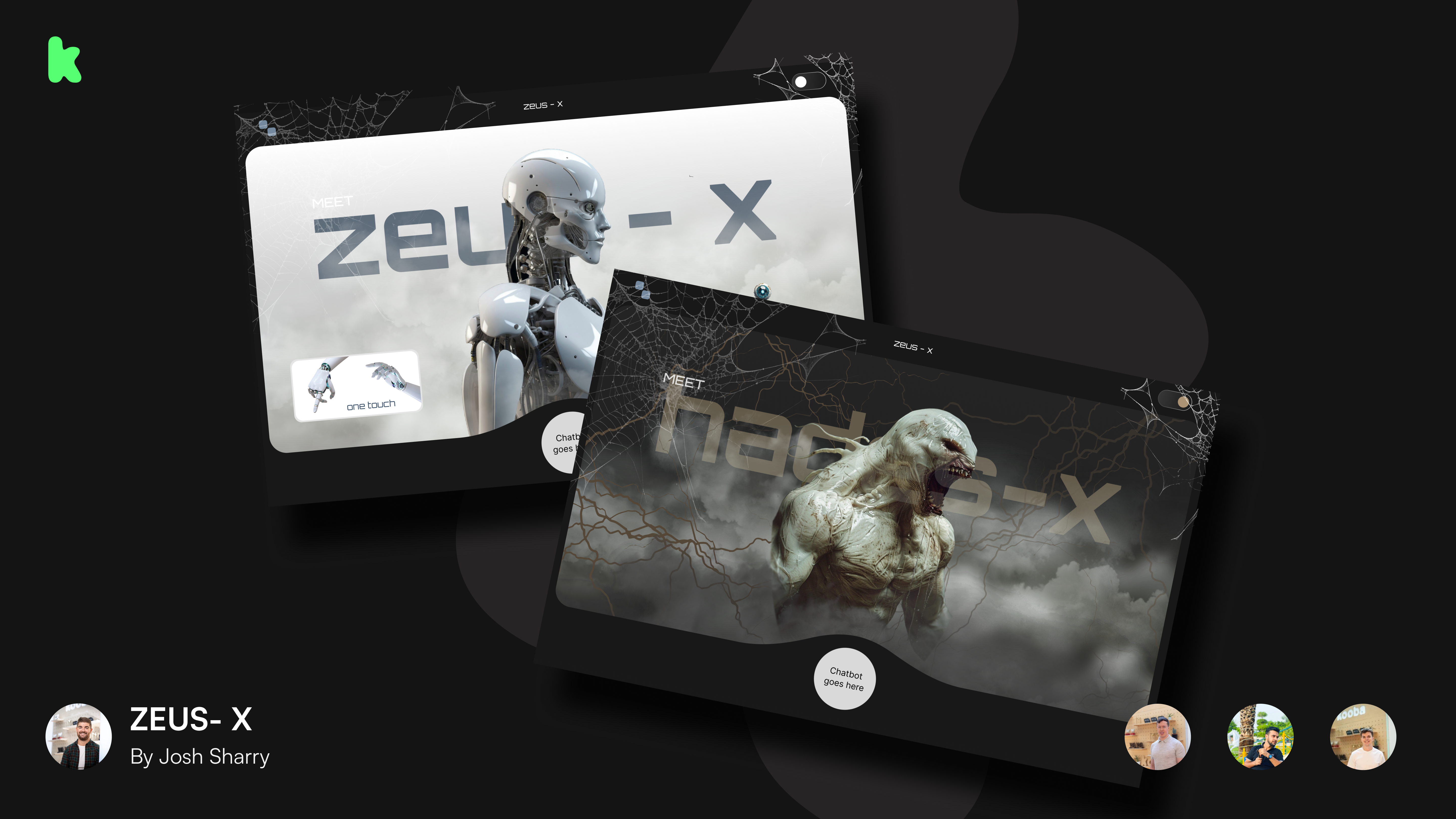
“We recently noticed Tesla’s announcement of their Optimus robot, and decided to build a site selling a humanoid robot which was secretly evil. We chose the name Zeus-X for the standard robot, and when a “do not touch” toggle was pressed it revealed Hades-X, its evil alter ego. We wanted the site to be super visual, so we kept it deliberately minimal to show off the robot itself. A lot of work went into the toggle, as the animation had to look as dramatic and impressive as possible.
The chatbot was designed to respond differently based on the name used in the prompt. For instance if you asked about how safe Zeus-X was, it would give a very appropriate and polite answer, but if you used the name Hades-X the chatbot would reveal its true intentions. We really liked this idea of the site having a secret that was revealed if you knew where to click and what to ask.”
Team 2: The Suspect
https://ross-mocktober.netlify.app/homepage
Design - Lauren Harkin
Frontend - Ross Daly
Backend - Ignacio Isas
Copy - Lea Kelly
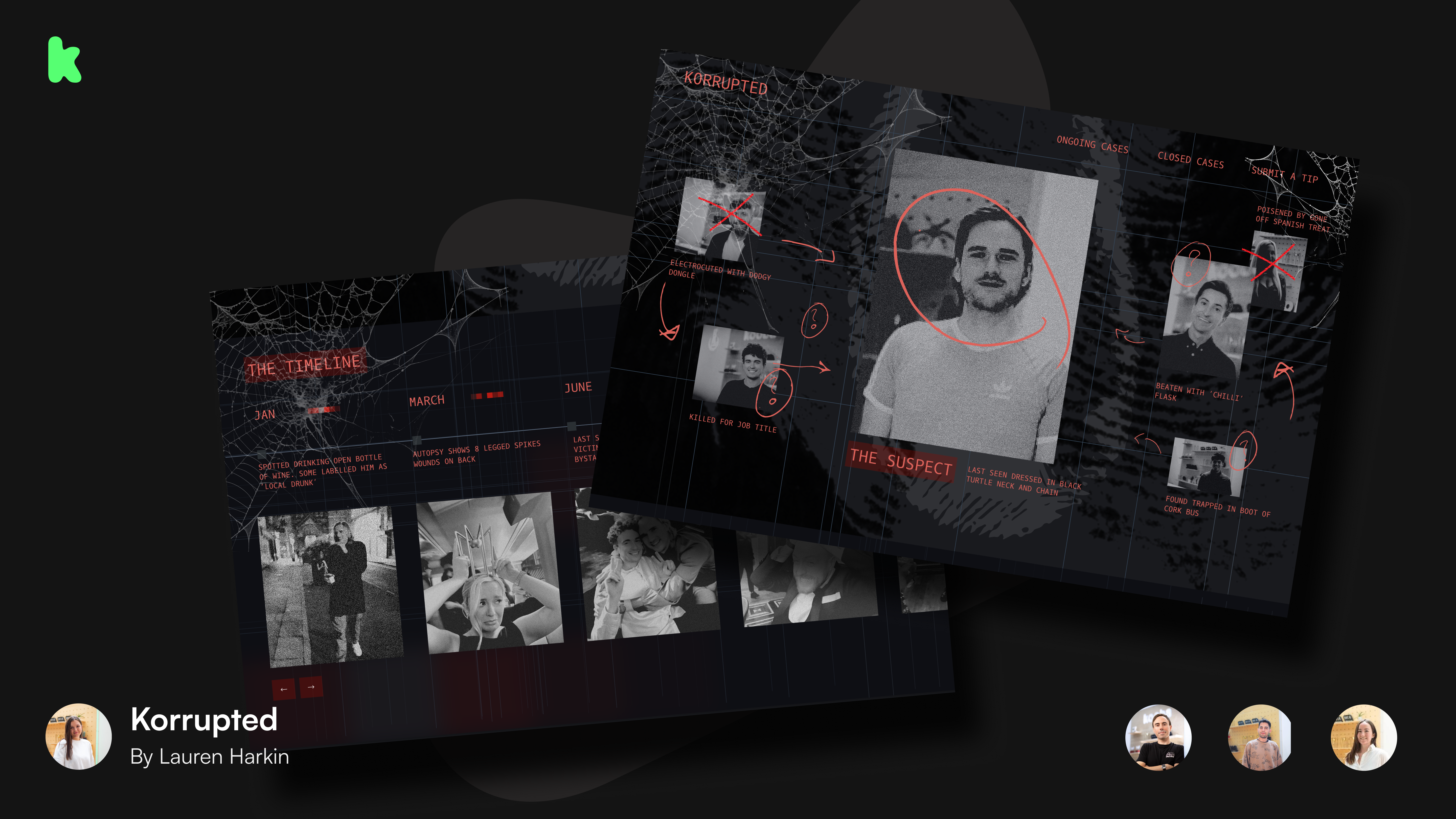
“This site was based on the idea of a murder mystery, with the site itself playing the role of the detective. We used the chatbot to interrogate the user, and this invited them to engage further with the content around the page. We added multiple choice answers to Intercom to make sure they stayed on a predetermined pathway, and this allowed us to control the user experience and the narrative of the mystery.
A great feature was the side scroll, which was intended to mimic a detective flicking through different pieces of evidence. By changing the lighting and speed of the scroll we were able to create a nice immersive experience for the viewer, and add some tension to the story.”
Team 3: The Substance
https://sean-mocktober.netlify.app/
Designer - Elena Rimeikaite
Frontend - Sean Smyth
Backend - Christian Rochford
Copy - Evan Farrell
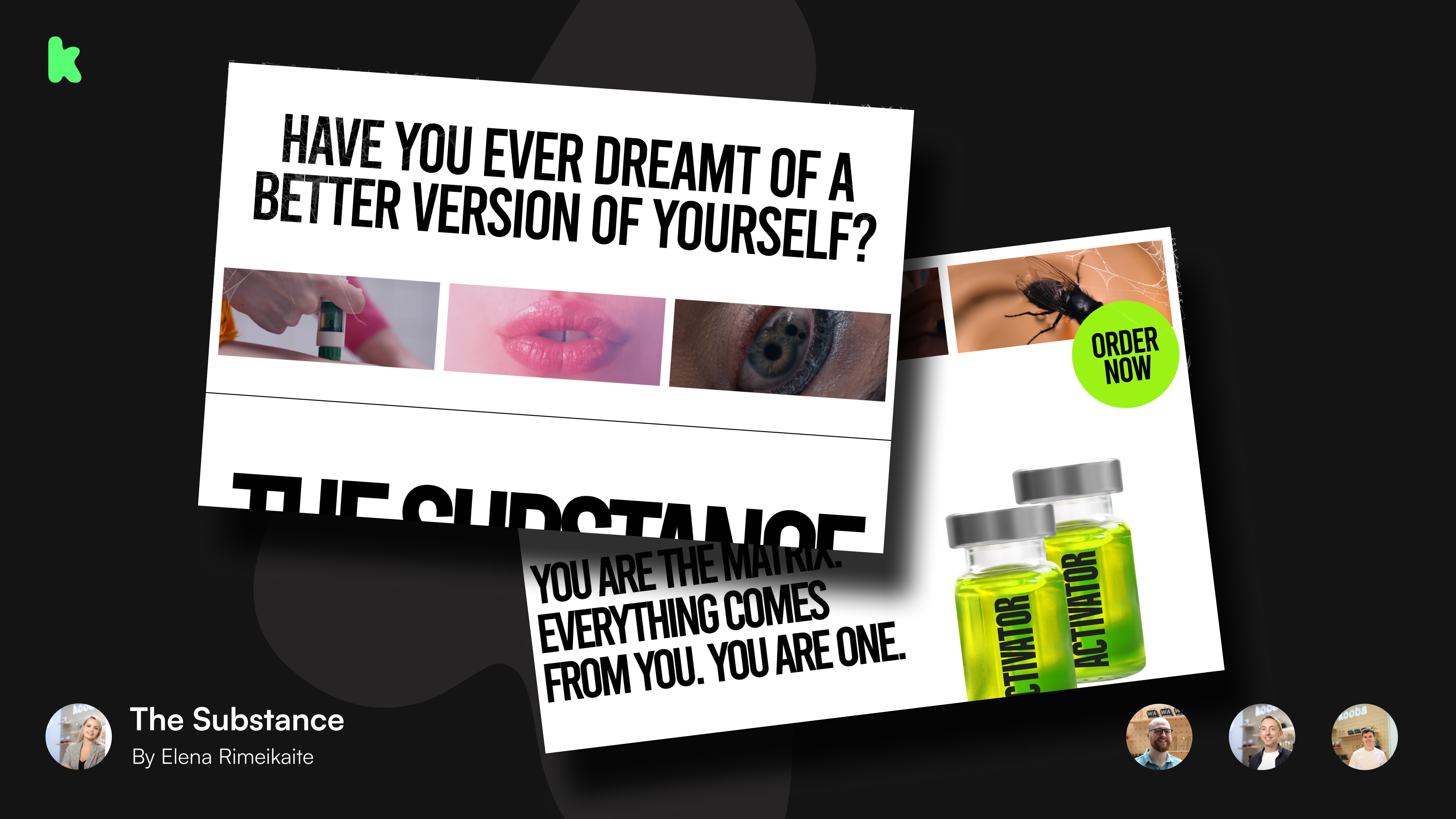
“Obviously, this project was based heavily on the recent film The Substance. We wanted to build a site that would serve as a sales and customer service platform for the fictional company distributing the substance. Because we were basing this off of a film, we made use of as much video and visual content as possible, and the site really captured the gruesome vibe of the movie (don’t worry, there’s no spoilers!). I really loved the use of audio on the site, which was linked to the scroll. It catches the user off guard a little bit, which is really fun, and something we normally couldn’t do on a commercial project.
For the chatbot our priority was mimicking the tone and voice of the customer service for the substance in the movie. We were able to upload sections of the script into Intercom to help capture this, and this made for an even more immersive and cohesive experience.”
Team 4: starcard
https://angeliki-mocktober.netlify.app/
Design - Duncan Menzies
Frontend - Angeliki Manolopoulou
Backend - Gerardo Ancheta
Copy - Lea Kelly
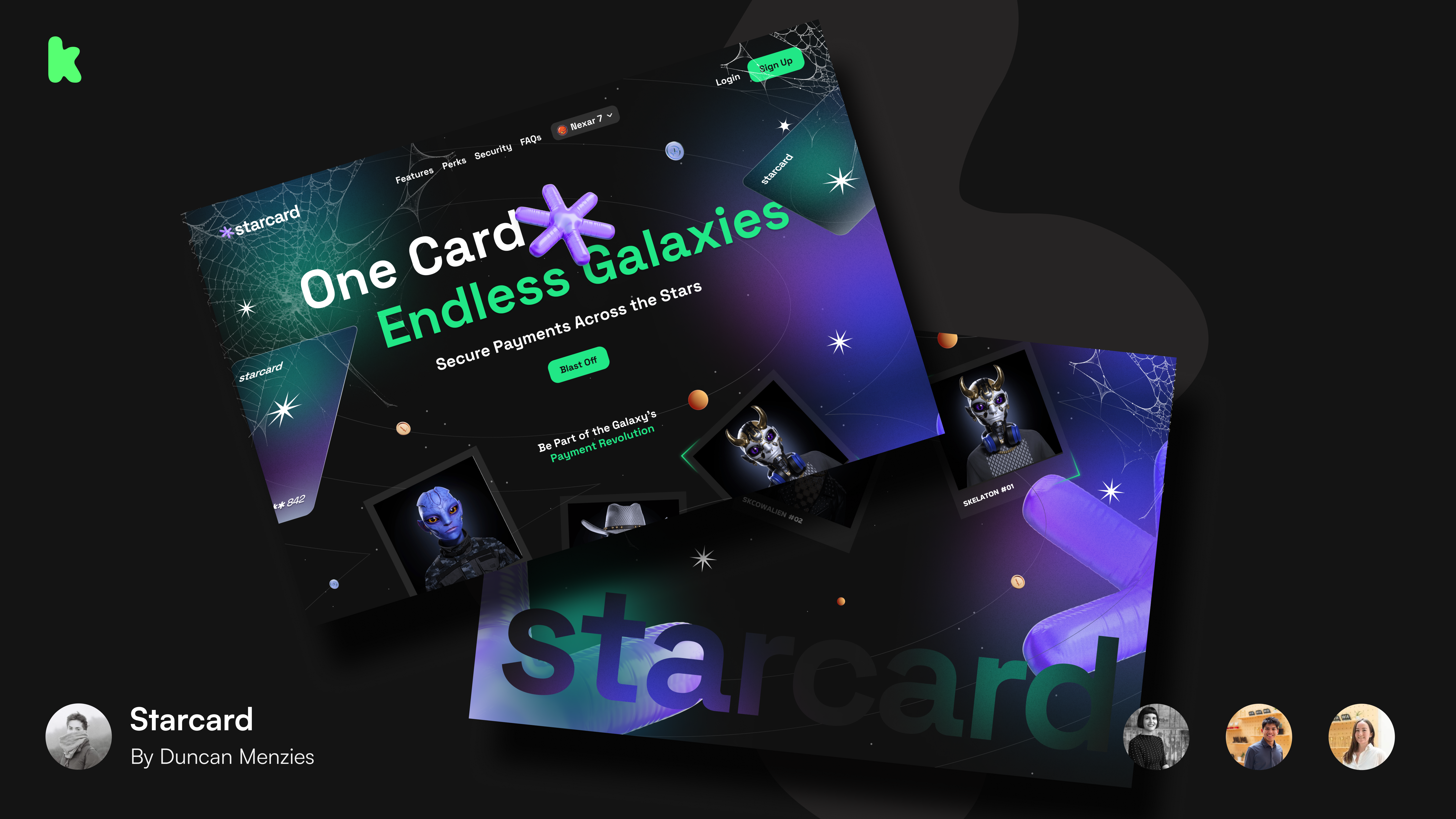
“The idea behind this website was a banking site for aliens, with a selling point of being able to transfer money across different galaxies. We laid out the page as you would expect for a banking service, but we had a lot of fun with the cursor and the animation of the star when opening the website. We included some nice little details, like the galaxy selector in the header. I always love the experience of immersing yourself in a design process, and it's fun to pretend this fictional company is real and imagine what services they might want to offer on their site.
We wanted the chatbot to be a bit cheeky and funny, so we gave our users a fixed pathway of questions to ask and then wrote custom answers to these on Intercom. We used a lot of imagery and gifs in the chat, and got very creative with our copywriting.”
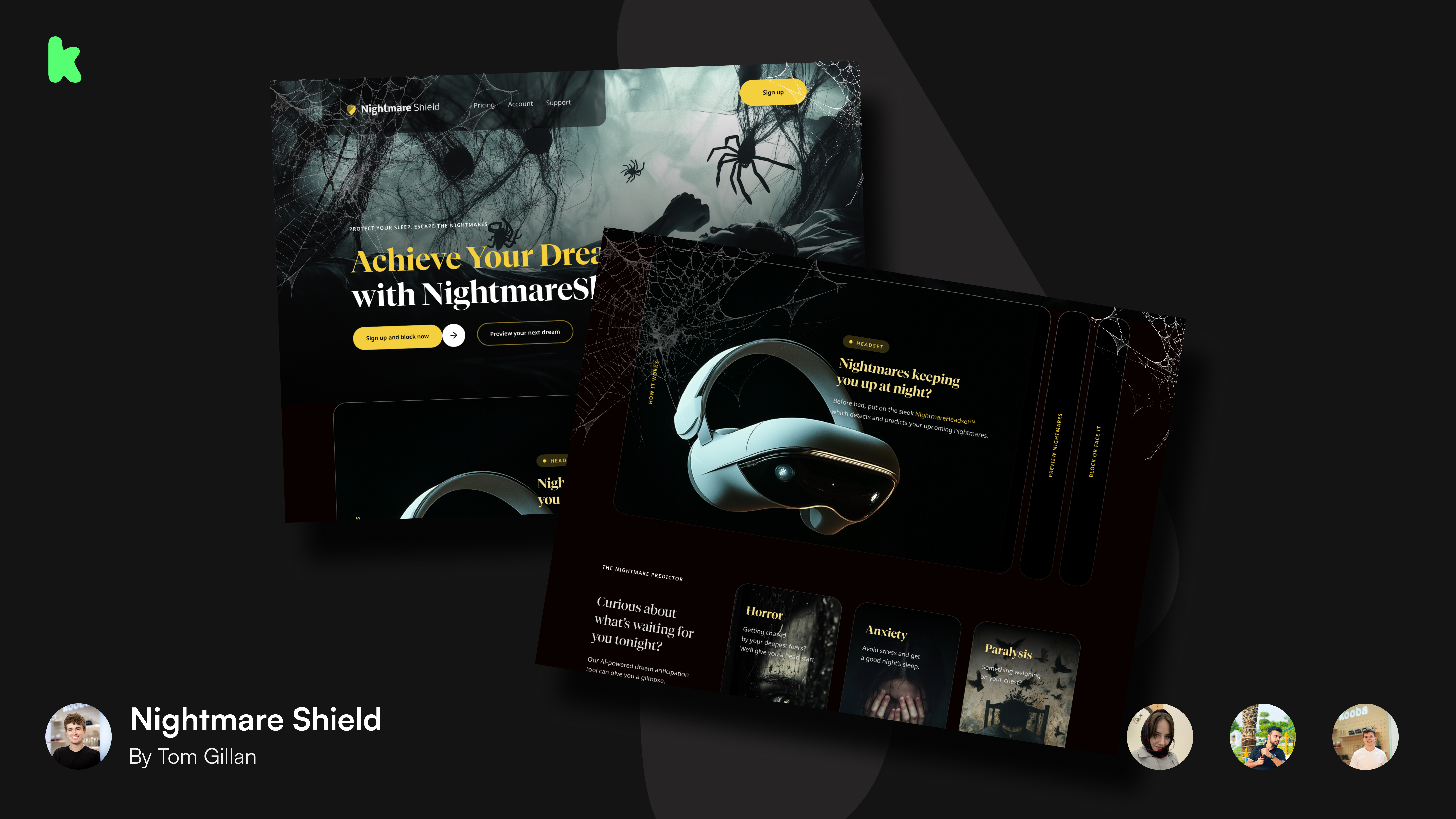
Team 5: Nightmare Shield
https://tom-ksenia-fahad.netlify.app/homepage.html
Design - Tom Gillan
Frontend - Ksenia Pedaskoo
Backend - Fahad Patel
Copy - Evan Farrell
“For this project we imagined a product that would let you control your dreams and prevent nightmares. We decided to build a site that would scare users into buying this product, and even pay for a premium version that would guarantee a good night’s sleep. A lot of the design reflects this, with terrifying visuals on the homepage, and some really prominent CTAs to get users to sign up.
We loved the idea of a Spotify style queue for upcoming nightmares and we tried to show this with a “nightmare predictor” section. Again the idea was to scare the user into signing up in order to avoid these. We also used Intercom to create an AI powered chatbot that could answer a variety of questions based off of a limited number of sample answers, which was really useful.”
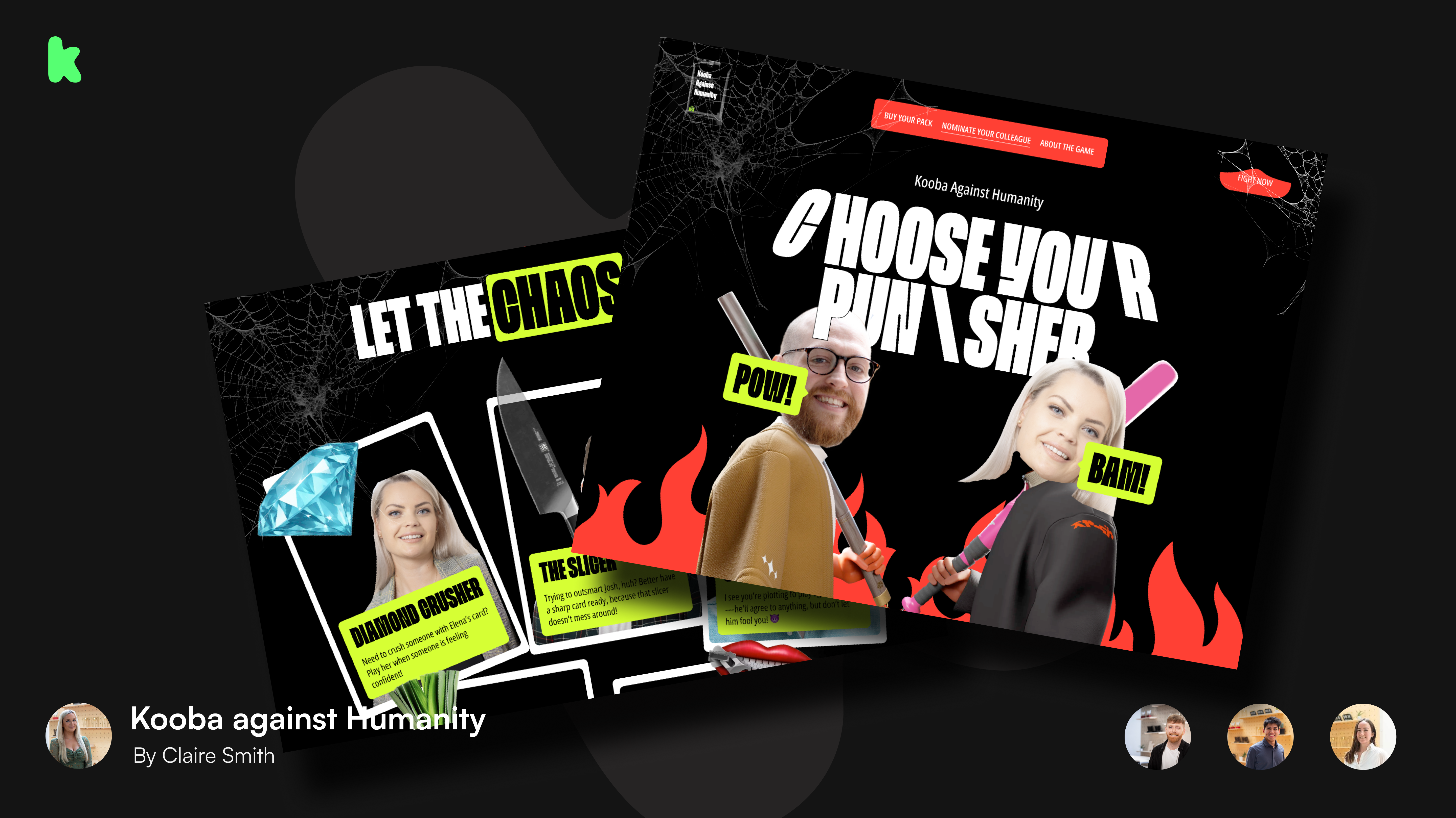
Team 6: Kooba Against Humanity
https://winning-mocktober.netlify.app/#
Design - Claire Smith
Frontend - Brendan Mac Donagh
Backend - Gerardo Ancheta
Copy - Lea Kelly
“We took some inspiration from the Cards Against Humanity game, and we decided to make our own version based on different jokes we have within the Kooba office. We made cards for different team members based on funny things they’ve done in the last year, and we then built a fighting animation that could be toggled on and off. I think the copywriting and UI really made this project, with it really capturing the lighthearted sense of humour amongst the team. We went a bit over the top with our visual design, which I always enjoy, and I think it really helped the jokes we wrote.
Our chatbot was meant to simulate the experience of office gossip, and we deliberately provided the user with chat options that would drag them into drama and funny situations. We also made sure it matched the visuals of the overall site, so it didn’t feel out of place.”
