As an agency we love nothing more than when a project pushes us to the next level, and the National Disability Authority project did exactly that for us. We partnered with NDA with the goal of creating the flagship website that would set web accessibility standards across Ireland.
The National Disability Authority (NDA) is the independent statutory body, providing evidence-based advice and research to Government on disability policy and practice and promoting Universal Design. NDA assists organisations such as the Minister for Children, Equality, Disability, Integration and Youth in the coordination of disability policy while also promoting Universal Design through their Centre for Excellence in Universal Design.
Objectives
Our process started with identifying the core site objectives which included:
- Revising and updating how the website is structured to highlight and promote NDA’s work
- Creating a site that acts as strong communications platform
- Implementing a robust dynamic search function
- Ensuring Web Accessibility Directives are fully complied with
- Communicating NDA’s role and value in a more dynamic manner
The digital presence of NDA aimed to establish the organisation as a trusted and reliable source of information for individuals with disabilities. Site content was an integral part of the website redesign with considerations taken for thematic structuring of the site. It was important that the finished product functioned as a key communication tool for the organisation.
It was also important for the National Disability Authority that the overall look and feel wouldn’t be thrown out the window - the design challenge for the project was to curate a site with a dynamic and attractive appearance that would still adhere to accessibility requirements.
Strategy
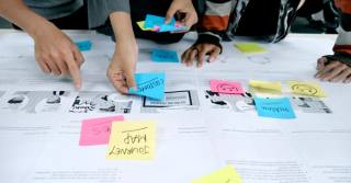
We knew the most complex part of the project would be nailing down the UX and providing a clear sitemap. To achieve this we held a number of card sorting workshops, both remotely and in person, which collectively organised the information architecture based on analytics and new business objectives. This allowed us to create an initial version of the site map which was then stress tested with the client. The workshops required us to be even more collaborative in our workflow and to take special considerations for client accessibility needs.
Our digital strategy for the project also focused on the brand traits, user values and anti-values (the do’s and don'ts for bringing value to site users).
We were able to pinpoint the NDA brand, how the associated online presences were currently seen, and where the ambition was for the future.
From this survey we identified key objectives that guided our creative process:
- Convey professionalism and trustworthiness.
- Establish a high-quality, reliable and factual feel.
- Prioritise usability & clarity
You'll notice that accessibility wasn't one of the key objectives called out, given this was understood as a baseline requirement and taken into account at every project stage.
UI design
Using a combination of qualitative and quantitative research findings and data as a guide, we began the Homepage redesign focusing first on the mega menu. Our research indicated that the NDA user base would expect more than the normal filtering of content through drop downs. Therefore a browse-by-theme section was introduced to help further funnelling to key information, as well as a site wide search feature to help users drill down to desired content.
It was important that accessibility did not hold back our creativity, but rather, forced us to think outside of the box and design in a new way. Just because the website is accessible, doesn’t mean it shouldn’t look great. The use of brand colour is a prominent aspect of any design process and special care was taken to have colour enhance the site rather than act as a blocker to aesthetics.
Language exploration was conducted to enhance site inclusivity. The incorporation of an Irish Language feature as well as Irish Sign Language videos increases user potential and experience.
Innovation & technology
When it came to implementation, our developers took meticulous care to produce clean code that was tested against requirements such as screen readers, colour ratios/contrasts and alt. text abilities.
Core technologies used throughout the project included:
- Screen reader software: This software allows users who are blind or have low vision to access the content on a website by reading it aloud using text-to-speech technology.
- Alternative text: This is text that is associated with images on a website, which allows screen reader software to provide a verbal description of the image for users who are unable to see it.
- Keyboard navigation: This allows users who are unable to use a mouse to navigate and interact with a website using only their keyboard.
- Captions and transcripts: These provide written versions of audio and video content on a website, allowing users who are deaf or hard of hearing to access the information.
The website needed to be accessible from every angle, right down to the content management system which is fully accessible for WCAG AA standards.
A key learning for Kooba in this project was working with NDA and their accessibility expertise. Workshops, client meetings and project deliverables were adapted for visually impaired team members as well as people with hearing difficulties. This meant that we not only had to step into the users shoes but also the client’s ensuring workshops and training sessions were fully accessible.
Implementation & results
Since launch in November 2022 the site is already delivering results. The site is fully responsive and renders beautifully on all devices (Kooba is a mobile first agency, so this matters to us).
We delivered a flagship platform for accessibility that can be easily navigated and consumed by everyone;the entire site is built to the stringent AA grade of the Web Content Accessibility Guidelines (WCAG) standards - which is fitting for this particular site.
Overall, Kooba delivered a website that has set the gold standard for digital accessibility in Ireland. The finished product has been a labour of love, both challenging and strengthening our design and development teams. Key learnings have been taken from the project and have been built into the Kooba process given the growing importance of accessibility in web design.


