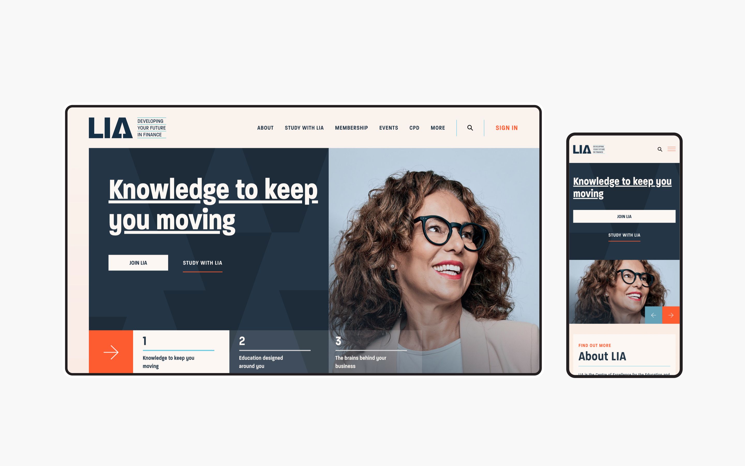
We’ve been working with LIA as their digital partner since 2016 so when they decided it was time for a website refresh we couldn’t wait to get started!
A little about LIA
LIA (Life Insurance Associated Ireland) is an education-based organisation offering a range of courses to aid their members in further development of financial qualifications and accreditations. LIA was established in Cork in 1978 and for the last 27 years they have played a key role in improving the standards of professionalism amongst those who give and support financial advice, through their education offerings.
Key project aims
Some objectives for the new LIA website included:
- Introducing the new LIA brand
- Improving the overall UX journey throughout the site
- Improving key onsite metrics and overall site performance
As with any project Kooba works on - the KPIs influence all stages. Our proven process ensures our clients can be confident with the final deliverable from the Kooba team.
The site
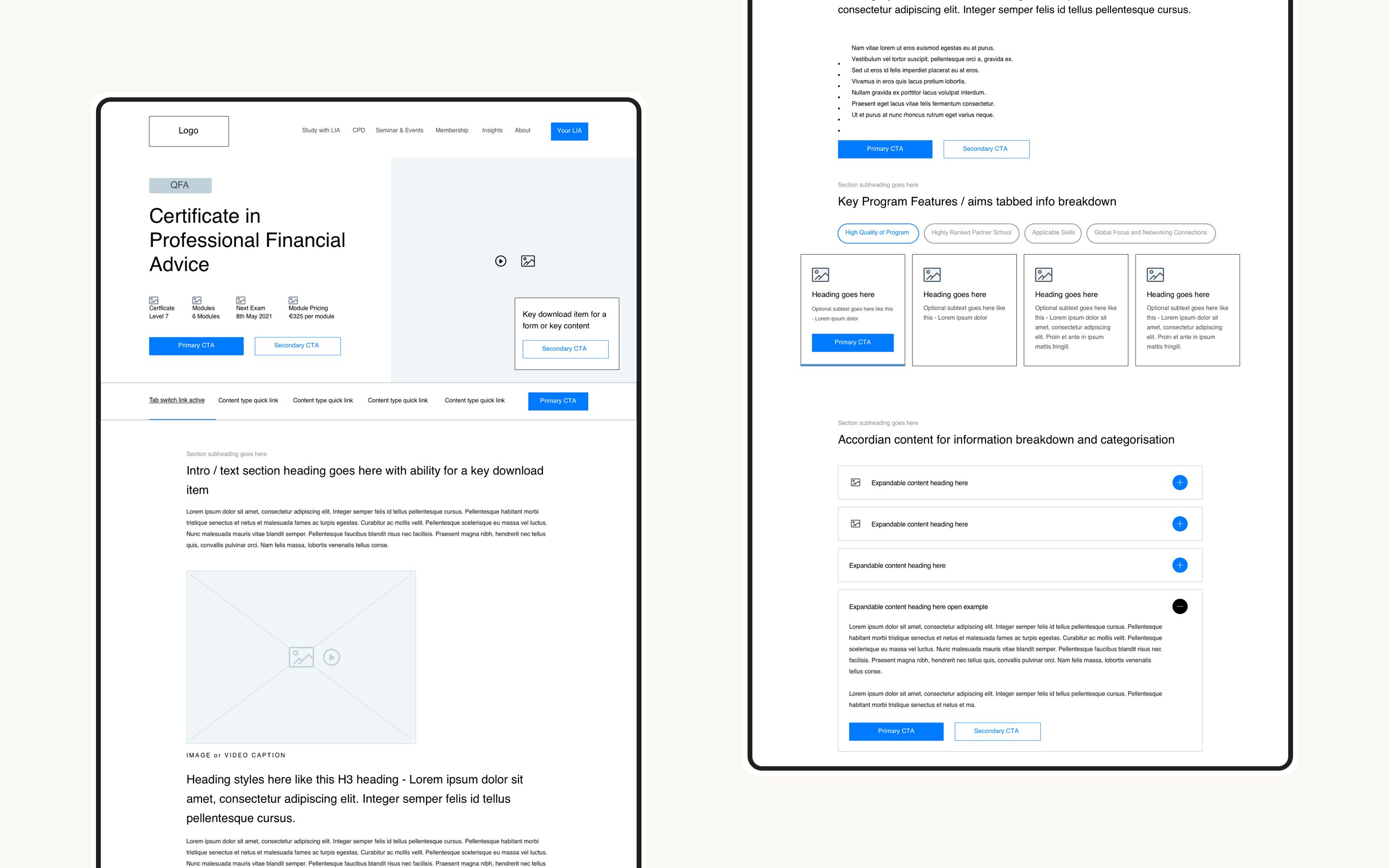
Kooba began the process in UX paying particular attention to key destination pages including the homepage, course pages, events section, education path and the members section. Google analytics, hotjar, stakeholder surveys and a detailed UX review helped us to identify patterns in user behaviour and allowed us to make educated decisions and recommendations based on the data and findings. We wanted to bring in new innovations to the site and build on items that users were engaging most with.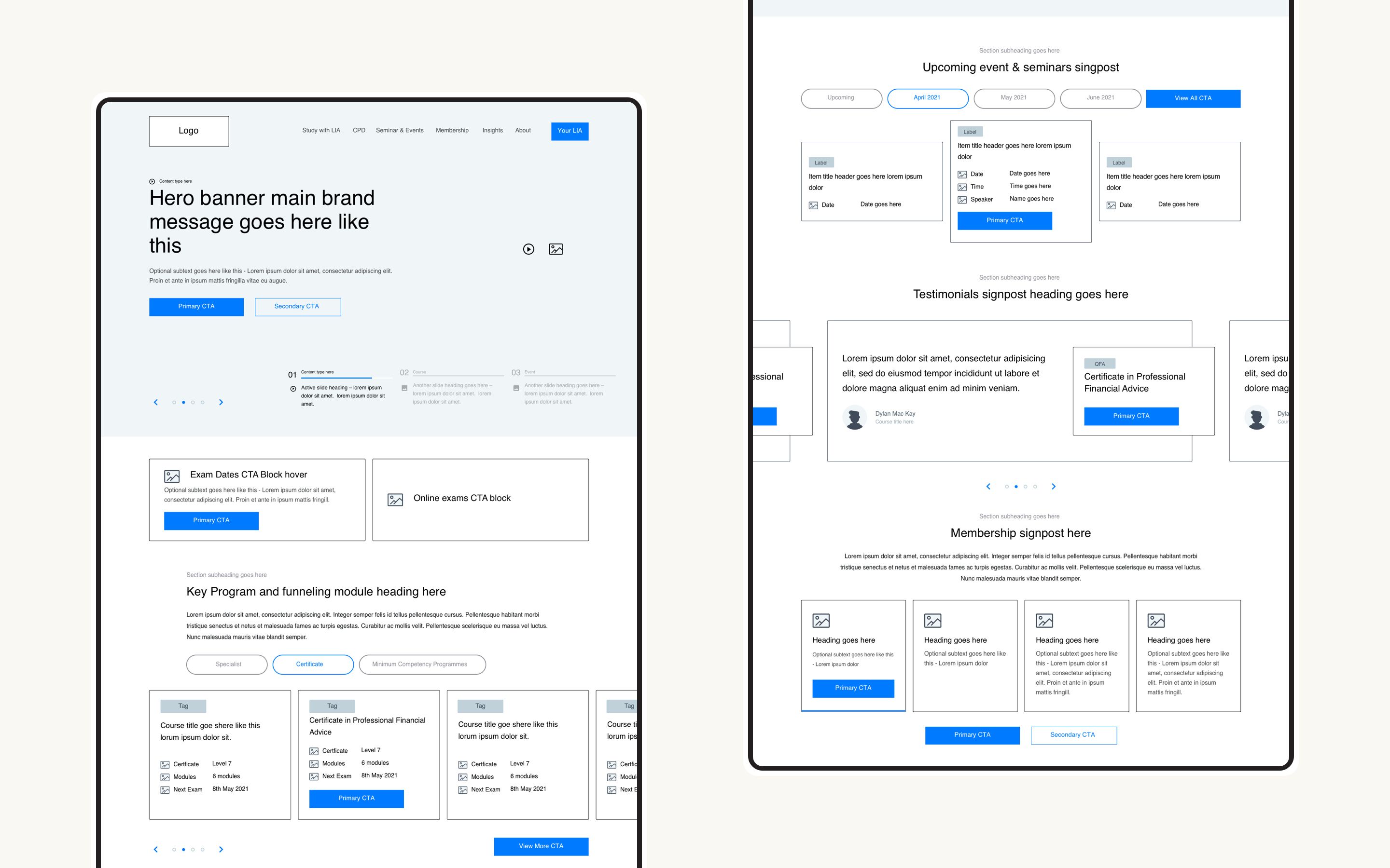
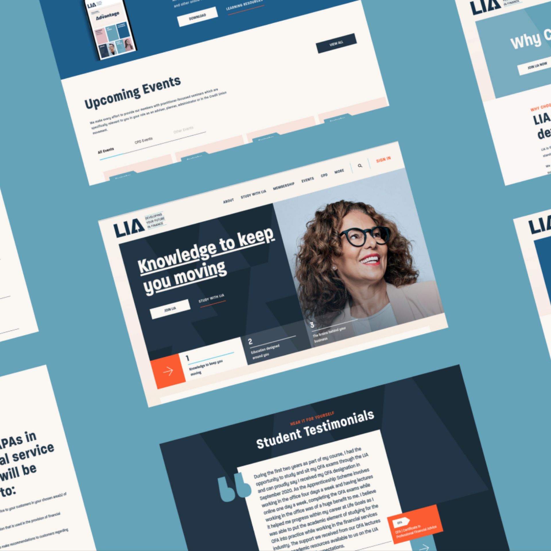
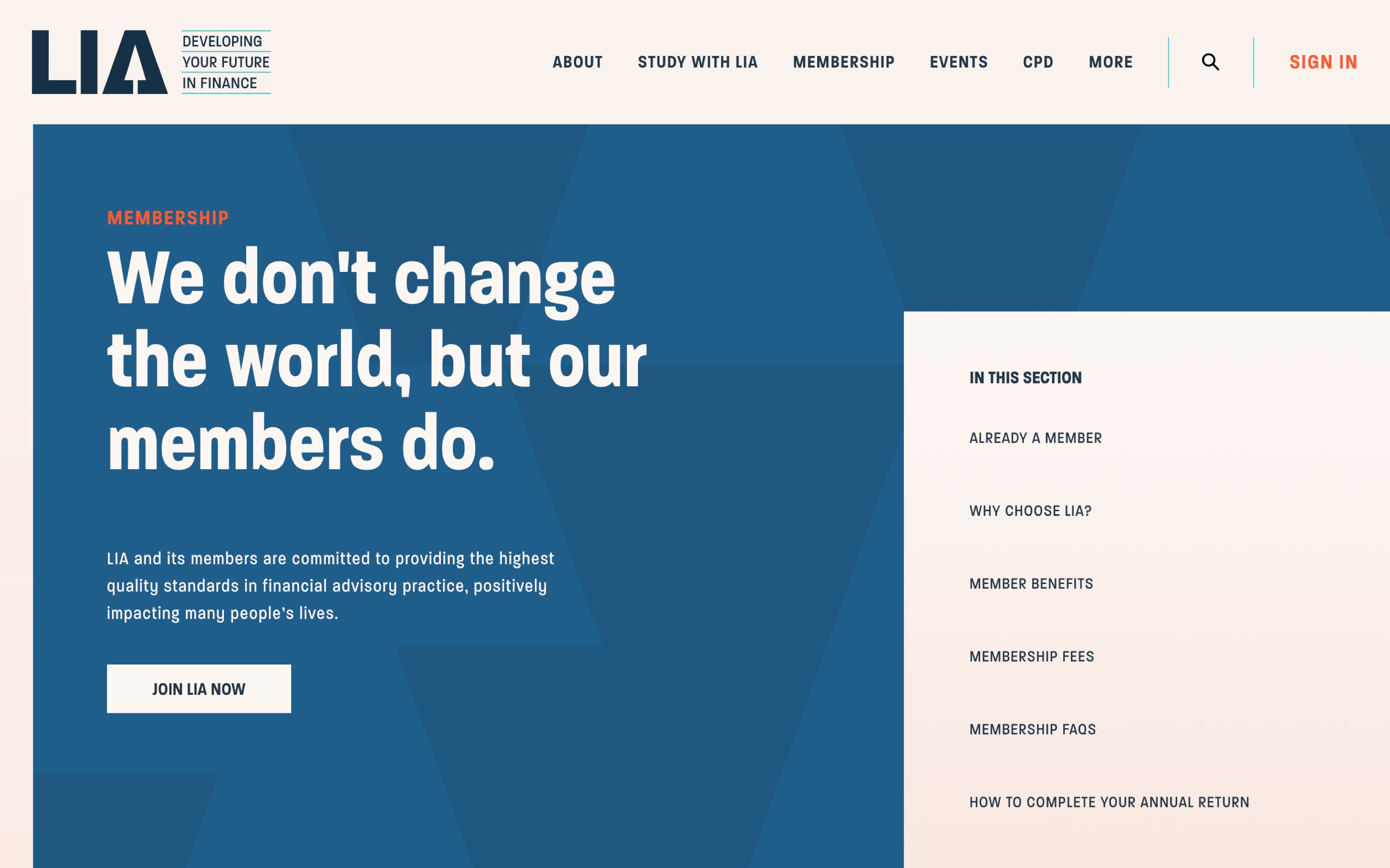
At the beginning of the project LIA also undertook a Corporate Identity brand refresh and working with the new branding and content strategy we were able to closely collaborate with LIA to push the envelope with the look and feel of the site. Throughout the UI phase, strategic decisions were made to ensure the site was in line with the newly developed corporate identity. Special attention was given to the banners on the site as an innovative way to bring key information to the forefront to ensure better site flow, quicker access to desired information and overall better user engagement. The ultimate goal visually for the site was to project professionalism and put LIA forward as market leaders.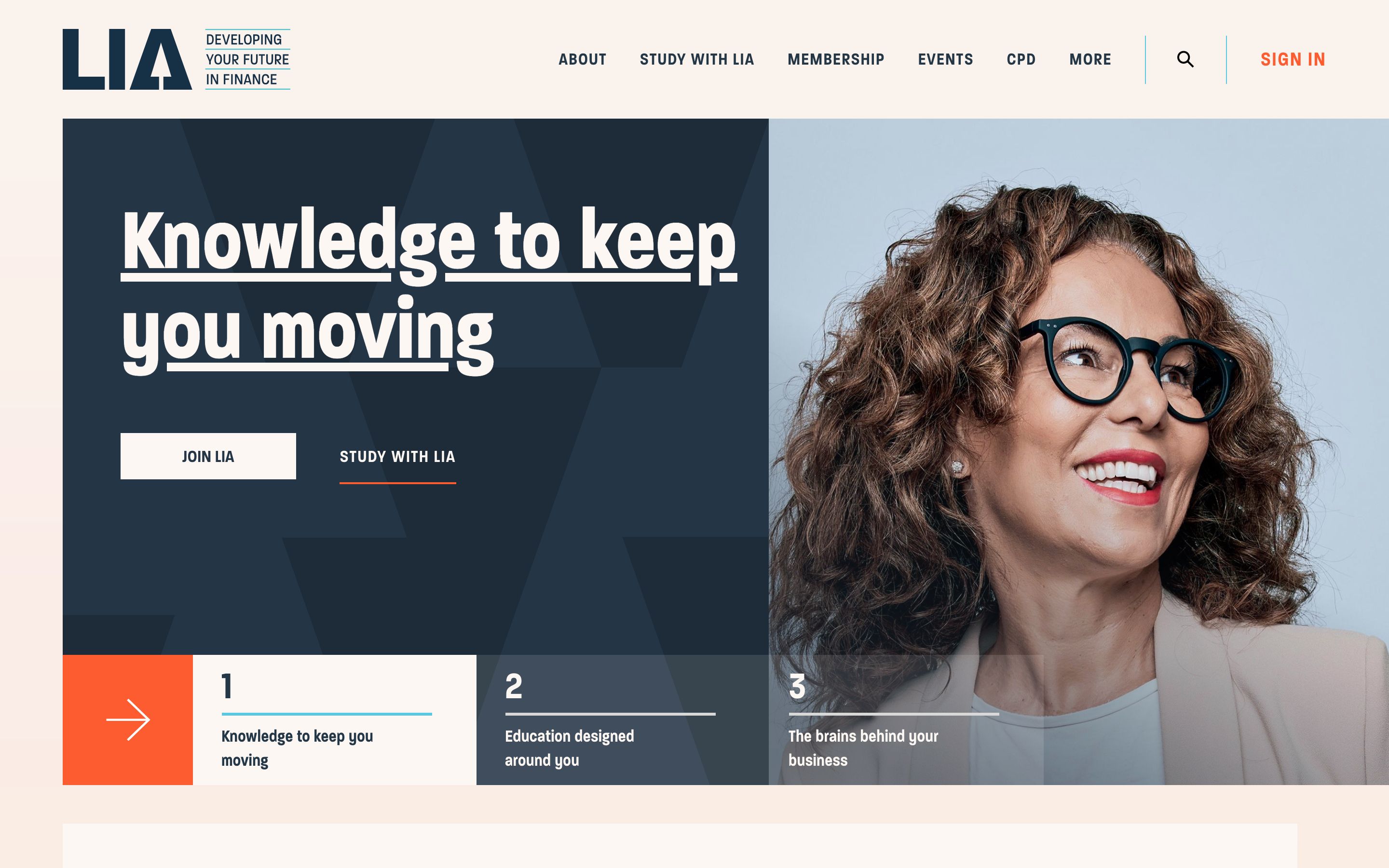
Throughout the project we let data guide us to making informed decisions, one of which included introducing in-page navigation for each of the course detail pages. Our hotjar findings indicated that users were engaging with very specific information types on different courses and to cater to these needs we wanted to give them quick access to their desired content from the minute they landed on the page.
It’s a project the whole Kooba team is really proud of and we look forward to continuing to collaborate with the LIA team.