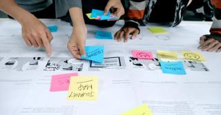
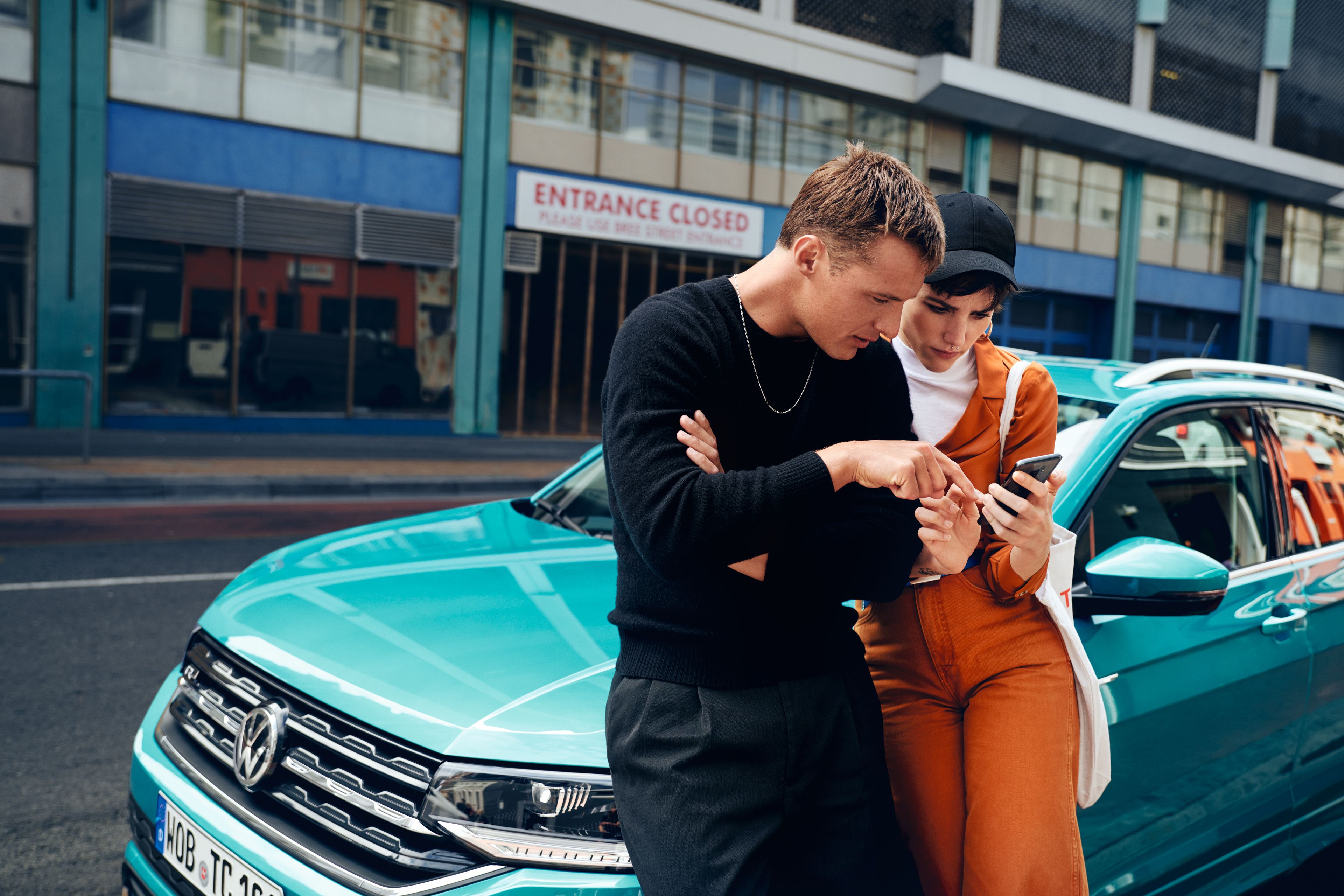
We’re delighted to announce another successful site launch from the Kooba studio: Volkswagen Careers! Here’s a bit about how we approached the website redesign.
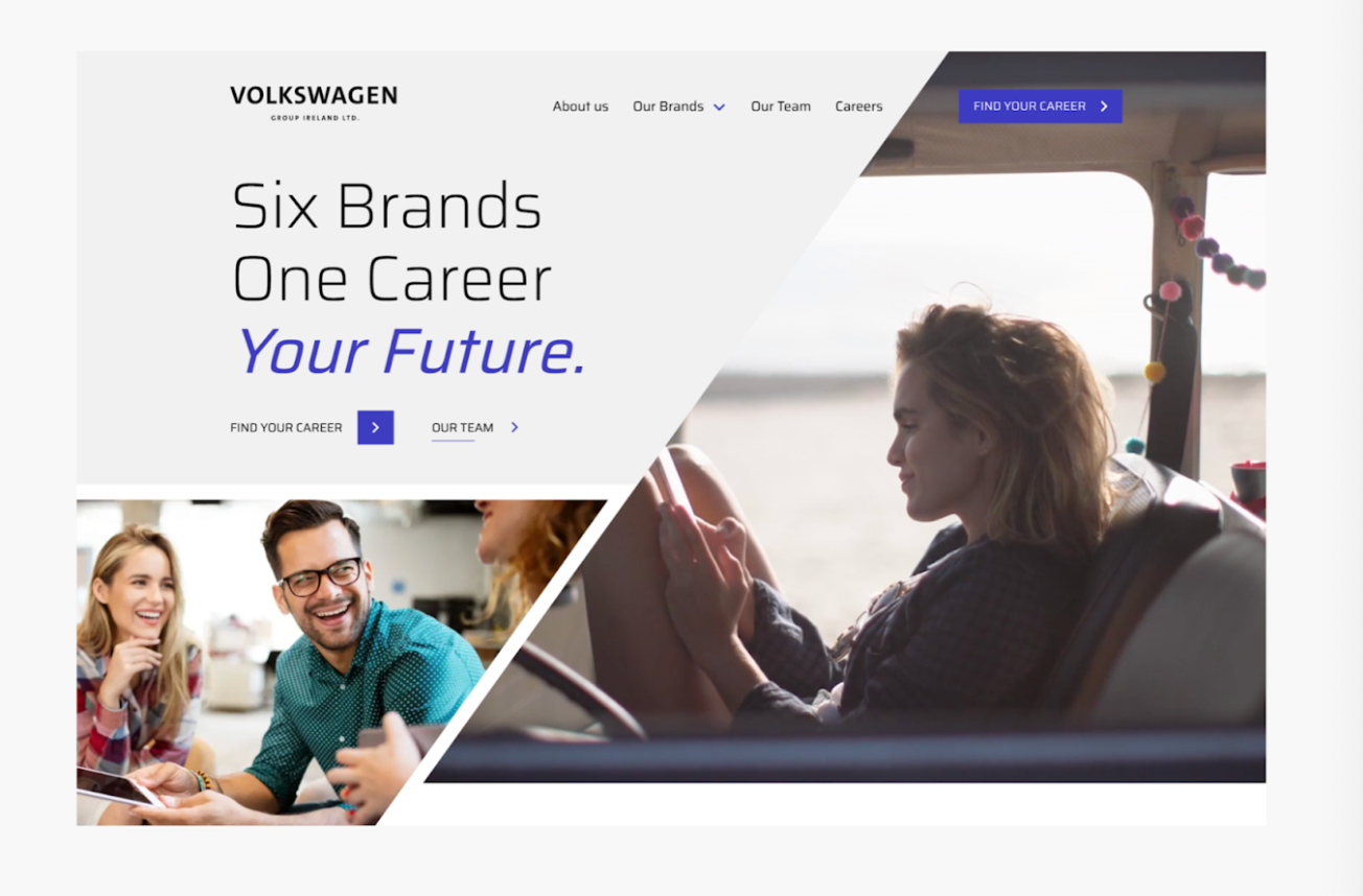
Movement
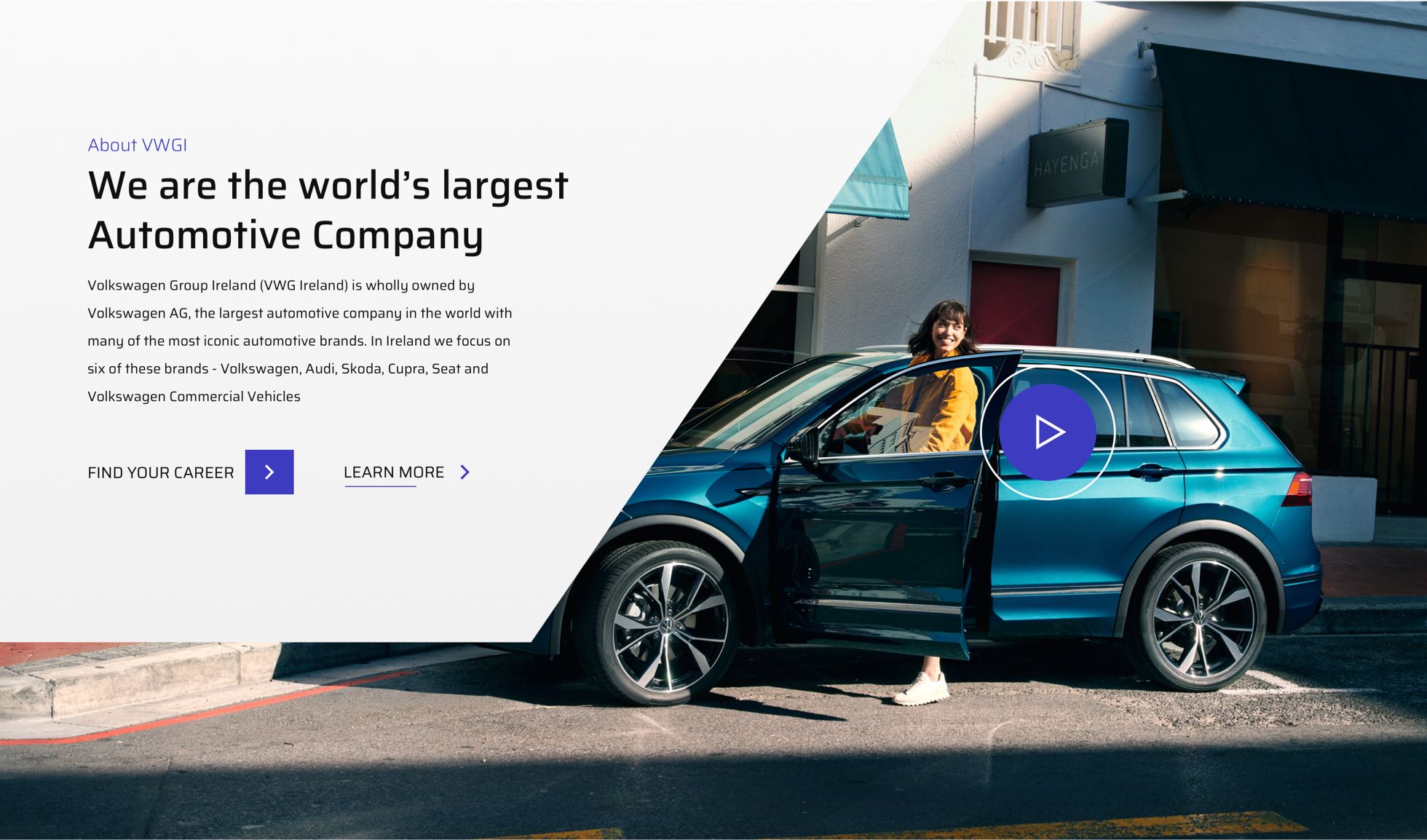
Angles in the design, coupled with animation throughout the site, not only reinforces the VW brand identity, but also gives a sense of constant motion and excitement. Creating angular features was a core design tactic to simulate the high-energy experience of driving in an iconic Volkswagen vehicle.
Visuals
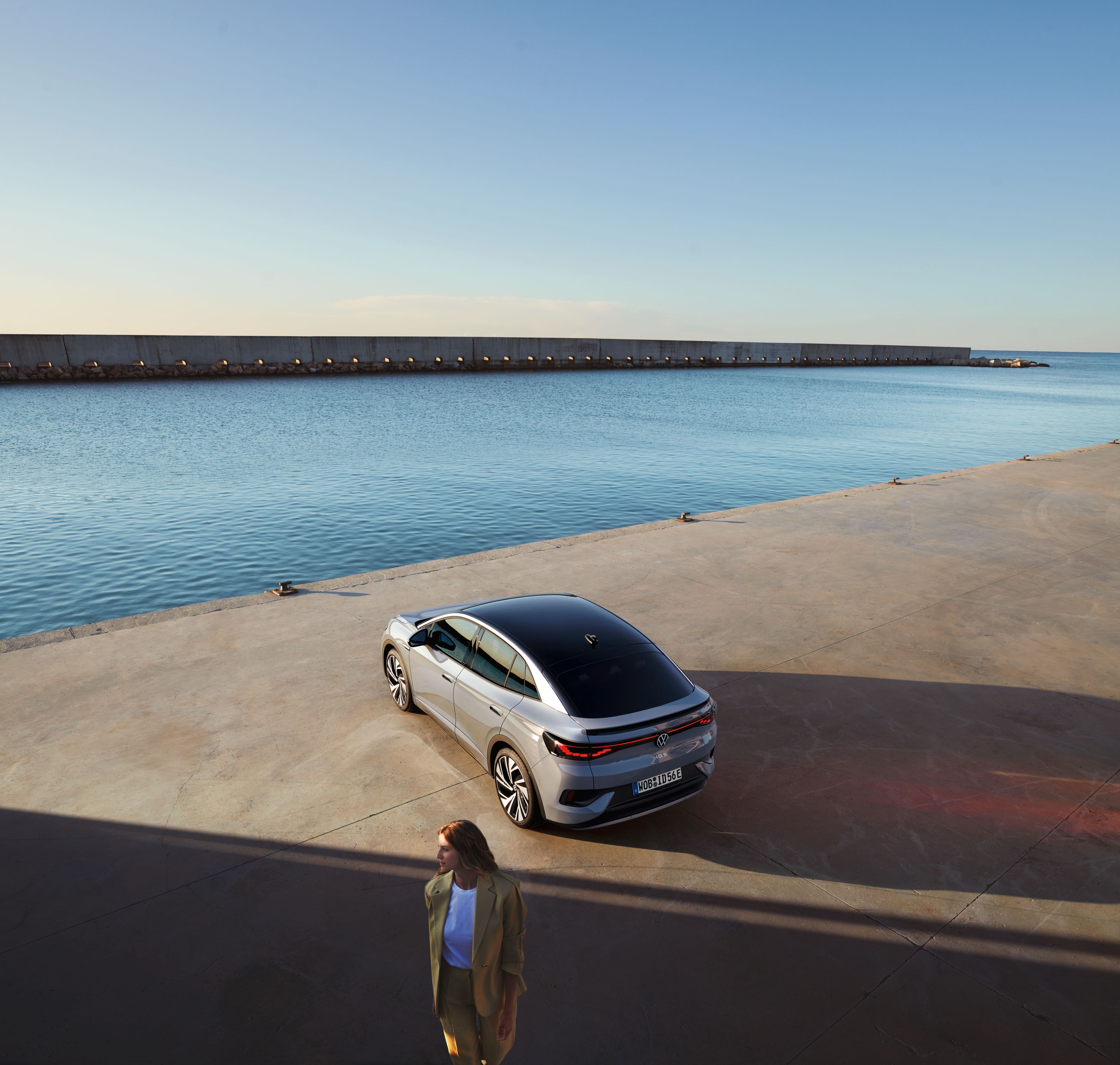
Volkswagen wanted stronger visual content across the site; in particular, there was a desire for strong imagery highlighting people and the Volkswagen community to add a personal flair to the ethos of the site. The visual component also included high-quality, engaging video content.
A career boost
Last, a core part of the overall strategy was to position the site as a source of information. The vision for the new site included clear application resources, guides, FAQs, and industry insights. We understood that the site needed to evoke a sense of career growth and excellence, something Volkswagen voiced as a priority in order to attract the skilled, ambitious people they are looking for.
Want to learn more about the Volkswagen project? Read more about our approach and solution in our Volkswagen Careers Case study.
Get in touch to learn more about our design approach and how we can develop a site that aligns with your goals.


