What does it mean to inform an audience?
In a very simple sense, it means providing them with relevant and useful information. This may refer to your product, service, brand, or anything else relevant to your business. Frequently, informative designs have nothing at all to do with commercial goals (take Wikipedia for example), but that doesn’t make a focus on user education any less impactful for private businesses. Until your audience understands the value of your product, it can be nigh on impossible to generate conversions across your sales pipeline.
And it’s not just short-term lead generation that feeds off user information. Your brand identity relies heavily on what customers actually know about your work. Of course, this understanding can occur organically, but any proactive marketing operation should seek to actively teach their audience the exact value of their offering. In fact, the perceived value of a brand is often in its ability to provide useful information. If, for instance, you can become a go-to source of useful information within your industry, your status as a thought leader will follow naturally.
Here’s Kooba’s guide to building an informative and educational experience for all of your audience:
Information architecture
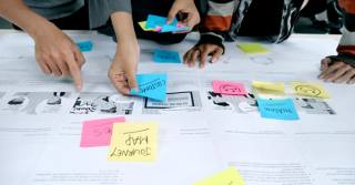
By designing an efficient and logical UX, users can be connected to the information most relevant to them in a simple and intuitive way. Often this occurs within a funnel, with users receiving information in a planned sequence. Kooba’s work on TitanHQ’s website for instance, first pushes users towards the product page, and only then encourages them to the pricing page. By channelling users into such a sequence we can avoid overloading them with too much information too soon, and instead ease them into a more productive conversion pathway.
Of course, sometimes the key is to show users a wide range of options that they can quickly pick from. But even such a seemingly unstructured layout contains an underlying strategy. How you decide to group pages, content and imagery all helps to facilitate more comfortable and productive user decision-making. This is one reason why Kooba aim to collaborate closely with clients during the design stage, as card sorting workshops and user interviews can transform the information architecture of a site, and help build a more engaging and intuitive experience for every user.
Focus on what matters
Informing your users can, and should, raise existential questions about your business and your product. One central question in particular needs to be asked again and again:
“What do we need to communicate to our audience?”
If you can define this in a succinct and clear way, half of your work is already done. The key here is saying less, not more. There’s a lot that you can communicate about your product, but you need to focus on the specific benefits and features that can win over users and generate business a tangible return on investment.
Kooba’s approach to web design mirrors this requirement. The priority is putting the right message in front of the right user, not bombarding them with an impossibly wide range of largely irrelevant content. This means thoughtful and carefully planned content sections, geared towards accommodating the interests of each user, and built with the complete collaboration of our clients.
Get creative
A picture can, apparently, tell a thousand words. This is certainly true when it comes to the tools available to web designers. With animations, 3D assets, interactive elements, and dynamic imagery, otherwise complex concepts can be made accessible and intuitive to every user. The key, however, is using such tools where they provide the most value. Imagery might be engaging by itself, but to be informative it needs to connect with valuable data and insights on your work. Engagement might be your goal (if it is, check out our guide on the subject), but it can detract from the educational value of a site if misused.
A balance is required across your website, with the right content being presented in the right medium. Take, for example:
- Our use of video content for Taoglas
- The dynamic background of GH Research’s website
- Holoplot’s dramatic use of bold imagery
All of these provide visual interest and build engagement, but do so for clear and functional reasons, and serve to assist in educating and informing their audience.
Provide a path
If informative design and user engagement might sometimes compete with one another, they also remain complementary in many ways. After all, users cannot learn about your product if they leave your site, and they cannot remain engaged without interesting content. The solution to combining these two elements is in guiding the user along a carefully designed pathway, providing just enough engaging content to retain their attention at every point. Each piece of information needs to link to something related and relevant, which is presented in as accessible and attractive a manner as possible. This makes learning about your company seem more natural, and feel more enjoyable.
Play the long game
Finally, the marketing value of informative design is often overlooked. A digital experience that connects users with information in an efficient and seamless manner helps to build positive long-term associations for your brand and business. Importantly, it also signals a willingness to let your audience make up their own minds, and hence a confidence in your own quality and reliability. This may not be as immediately profitable as a lead-gen focused website, but in the long run traffic acquisition and brand development will pay serious dividends.


