Why Engage?
Engagement can mean a lot of things. We are engaged when watching TV, reading a book, or even when waiting to be married. User engagement in a business sense contains some mixture of these different meanings. We want to entertain, inform, and ultimately convert our users, and a good website should generally do all of these things. Of course, the first step of accomplishing this is to define exactly what we want from engagement. Normally this is related to the development of a brand and the delivery of content to as wide an audience as possible, but it could also relate to lead generation or user education. As always for Kooba, the context matters, and will inform how a truly engaging site is built.
All Eyes on Me
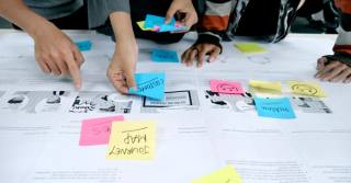
What we actually want from user engagement can be hard to define, but what we need to avoid is remarkably simple. As soon as a user leaves a site, any further benefit of engagement is immediately lost. Step one is therefore retaining attention for as long as possible, a metric we measure by the duration of visits on a page or website. Visit duration can be increased simply by providing each user with all the information they expect and need on a page, thereby preventing frustration and unnecessary exits. On Kooba’s projects this is accomplished through a thorough UX research and design process, featuring card sorting workshops, persona development, and rigorous user testing.
Promise More
There is more to engagement than just an efficient UX. In fact, a design which immediately provides users with all the information they need may in fact reduce visit duration and engagement rates, as users quickly convert rather than lingering on the site. This may be ideal for some (see our guide on lead generation if you think so), but often we want to increase engagement before converting our users. This means artificially prolonging a visit beyond what a user plans, which is accomplished by constantly promising visitors more engaging content, luring them deeper and deeper into a more engaging experience. Each page features links to more content, which then links to more content, and so on.
It may seem a complex way of retaining attention, but it certainly works. Most of us waste hours on social media for exactly this reason, chasing the promise of one piece of content after another. Even as we become bored of one blog, video, or post, we are immediately able to select another, prolonging our visit and retaining our engagement.
Retention and Reward
Of course, when users invest long spans of time into your site they expect something in return. A well designed and engaging UX will respect this, providing valuable information to users at every stage as they progress through their customer journey. In fact, the layout of a site may funnel users from eye-catching content on a homepage towards detailed work more relevant to their specific needs, serving to increase the density of information they receive as they invest time into the website.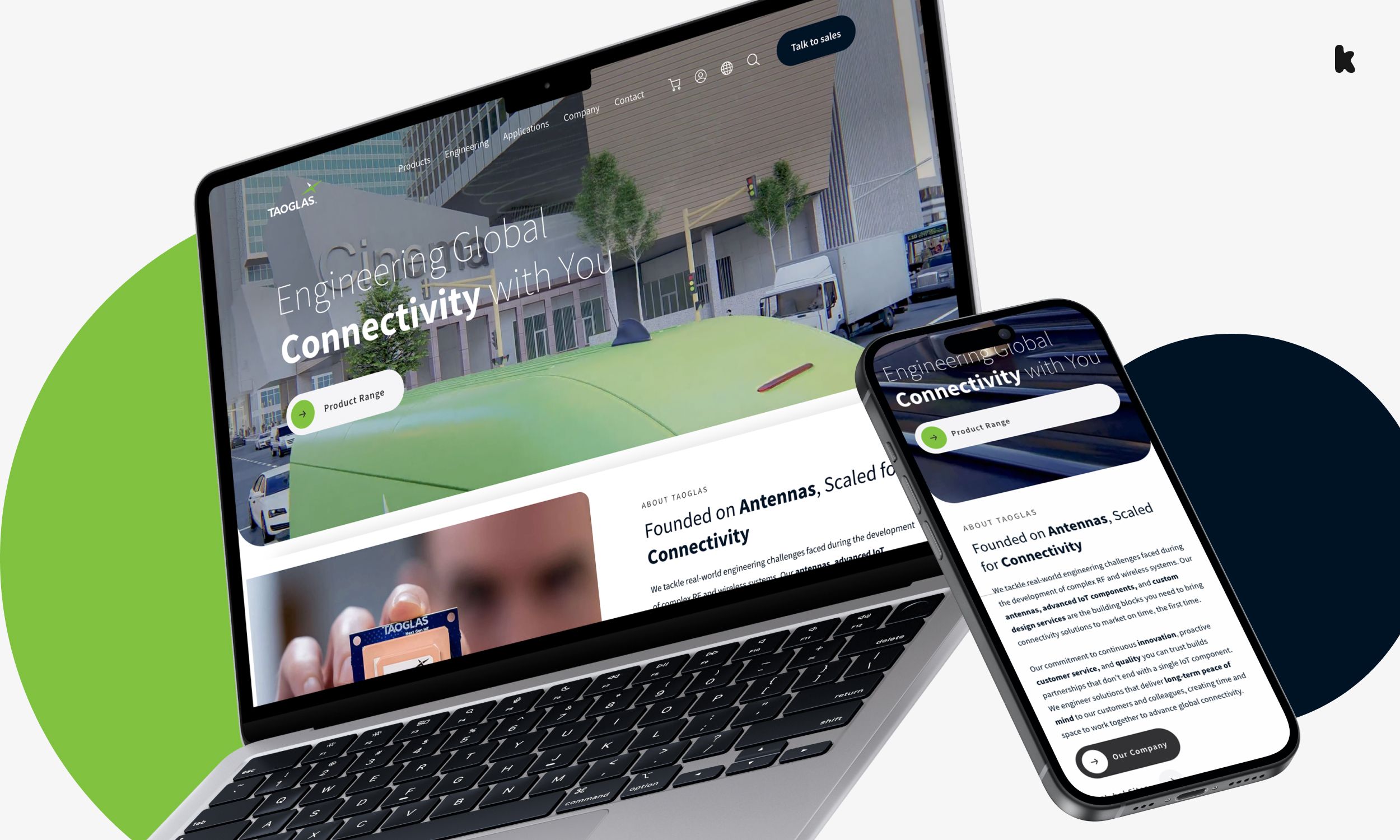
This is also true within works of content. An engaging blog post or case study will frequently introduce imagery, graphs or videos as a reader progresses through it. This serves to reward users for making it as far as they have, and breaks up an otherwise monotonous experience. It can also offset otherwise less engaging elements of content. If the actual message is boring, then the medium of delivery needs to be refreshing and interesting.
Have Fun
One of the great things about web design is that it allows for creative and engaging solutions that could otherwise never exist. Interactive graphics, animations, calculators, and chatbots can all offer novel ways of engaging and entertaining users. When possible, a website should display not only a visual brand, but also a dynamic one, which moves and responds to user actions in a clear and enticing manner. Through our comprehensive frontend development process, Kooba can incorporate such dynamic elements without compromising on vital performance or accessibility metrics.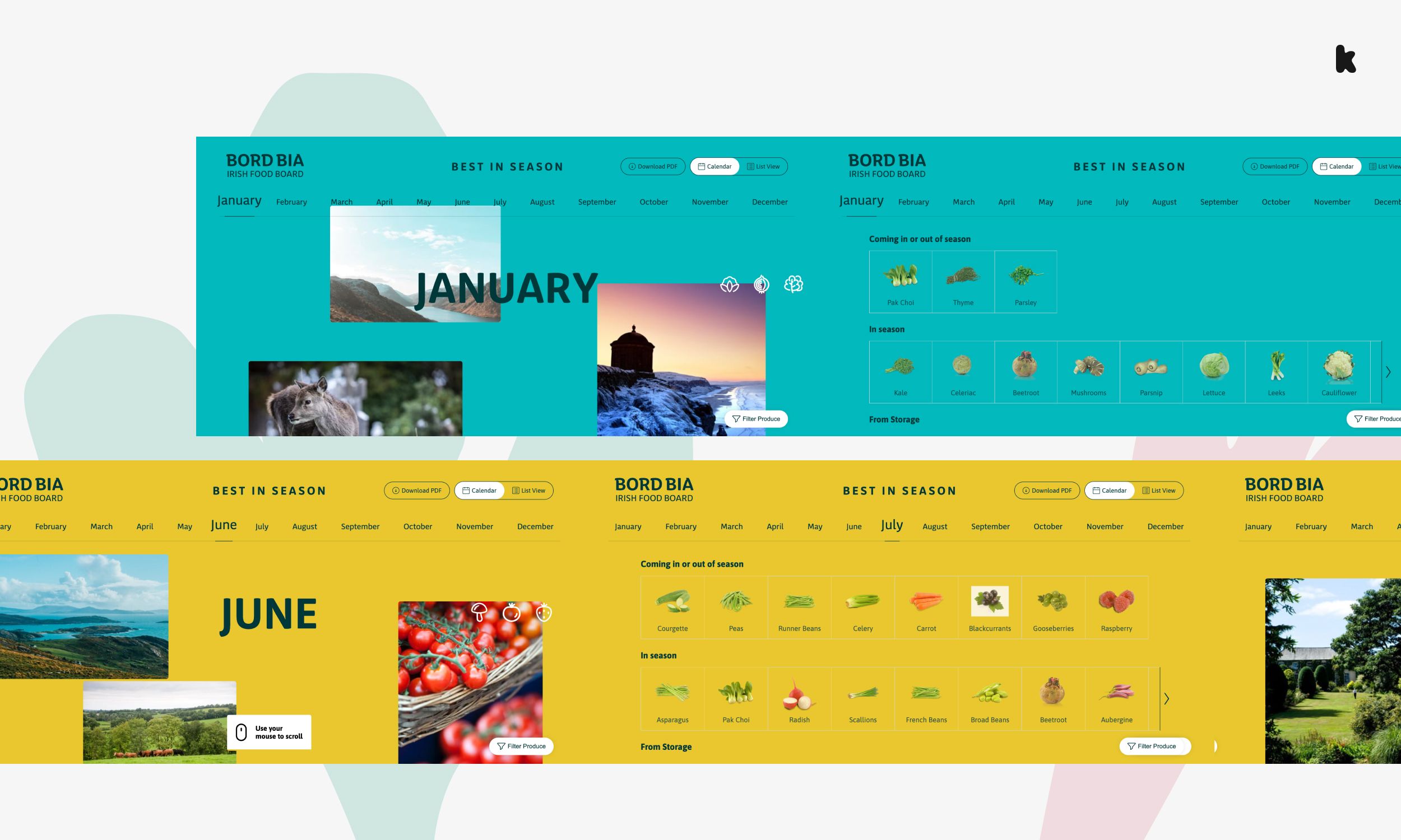
By building interactive features for clients, Kooba has helped deliver websites that are more engaging, more fun, and more effective at converting users. Take our Best in Season module for Bord Bia, which allows users to explore the variety of foods most suitable to each month, our illustrative video content on Taoglas’s homepage, or our responsive and dynamic backgrounds for GH Research’s site.
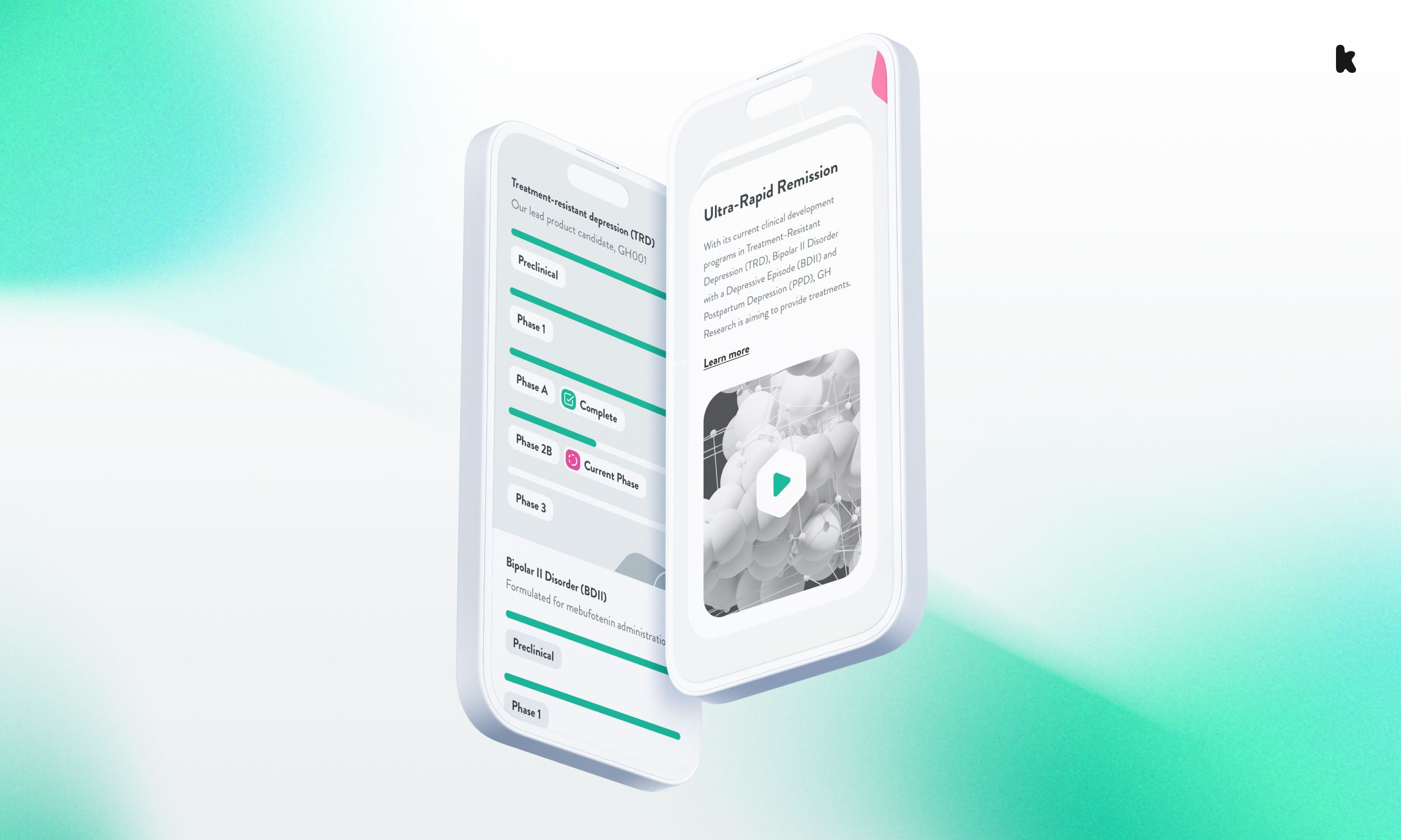
This focus on interactive and creative elements within a site helps drive up the engagement rate, another crucial metric for understanding how well a site involves and connects with users. The engagement rate observes the volume of interactions made per user and per page view. A high engagement rate indicates that users are clicking and scrolling more, and taking time to use interactive content and features.
Remember the Plan
If the ability to provide engaging and interactive content is fun, it also risks becoming too fun. When we design websites we can get caught up in maximising engagement at any cost, and easily forget why we wanted it in the first place. Maximising engagement can work for a site such as YouTube, who profit off the total visit times of their users, but endless engagement rarely translates to revenue in this way. Engagement should massage and inform users towards a conversion pipeline at some point in the future. This may not be immediate, but remains the ultimate goal of any content that you produce and publish.


