At Kooba we’re wedded to the idea of delivering a single visual concept. The rest of the world is not. It is standard practice across the agency world to deliver 2 or 3, and for that reason we tend to spend a decent amount of time explaining why one concept is the way to go.
The truth is that in modern web design multiple concepts are wasteful, usually unhelpful, and impose mental load on the client that actually belongs with the agency. Multiple concepts do nobody any favours.
So how did we get here?
To answer that we need a very brief history lesson. Back in the day the conventional approach was to keep the client outside of all creative work until concepts were shown. In other words, when the curtain was drawn back what clients saw was by and large a complete surprise to them.
In that context, you can be damn sure it helps to have more than one concept or approach to show. Anything is preferable to the dreaded words “I don’t like it” that will send the whole project all the way back to square one. So agencies came up with the clever ruse of showering the client with alternative approaches. If one doesn’t hit the mark then something else will - and if that fails we can always talk about what we like within each concept and create some Frankenstein’s monster out of the wreckage.
So as a rational response to a particular situation (the surprise reveal), multiple concepts weren’t a crazy idea. It’s a shame that very few people took the time to step back and consider not getting into the situation in the first place. But that’s exactly the approach we should be taking, and the approach we take at Kooba.
A better way
We firmly believe that creating a single concept is both more efficient and more effective than the multiple concept approach. And we are able to take that approach because we don’t believe in surprises. In fact, we hate them.
Clients hate them too of course. Nobody wants to be reminded of that time granny gave them a pair of Moshi Monsters pyjamas for their 15th birthday and they spent the next 15 minutes desperately attempting to look delighted. God knows why agencies choose to put clients through it but some still do.
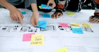
There is a better way. Take the surprise out of the equation. At Kooba there are no shocks and no surprises because we’ve worked alongside the client from the start and we’ve been happy to share thoughts around the visual direction we are taking.
This actually starts - in many cases - before we’ve even signed a contract. We’ll usually create some form of moodboard for new clients and we invite collaboration throughout the process. We’ll talk about sites we like at the workshop. If we work on branding, we’ll already have had conversations around colour palettes and visual direction.
But it’s not just about collaboration around visual look and feel. Our concept will only be created after we’ve signed off on wireframes and information architecture. At that point, there really should be only one direction we are following. What they say about the Epsom Derby is equally true of great visual concepts: if you think you have three winners you don’t have any. Multiple concepts is a sign of weakness, not strength. Too often they are created because nobody has a strong idea as to what happens next and there’s a belief that more equals better. That’s very rarely the case.
When we follow this process, one thing happens with remarkable consistency: we show our visual concept to the client and we hear “we love it”, “it’s spot on”, or some variant of those words. It makes us feel warm and fuzzy and our clients avoid the old Moshi Monster pyjama situation.
If you’re not already convinced, a couple of other things worth considering:
- One concept makes some clients nervous. That’s understandable, so we always reassure the client that the number of iterations that a design can go through is essentially infinite (we rarely need more than 2 or 3). Restricting the number of iterations that are ‘allowed’ on a particular concept is almost always counter-productive anyway - and clients hate it.
- In the mobile-first age, concepts are expensive. A concept has to show what each individual template will look like on at least three separate devices. That’s a lot of work. Creating three of those concepts just because ‘that’s what we always do’ is taking valuable resources away from getting one thing perfect and applying them to mediocre work that will end up on the cutting room floor.
- It saves a huge amount of time. In my experience (and there are exceptions here) it is very rare that an agency really believes that multiple approaches are equally worthy. They nearly always have a favourite, and a 2nd and 3rd concept exist to appease tradition and make the client feel they are getting value. But they take up time - and they particularly take up time when multiple concepts have to be combined. For the many clients who need something on a particular deadline, that’s a delay they can do without. All of this becomes possible, of course, when agencies themselves are willing to shine a light on the secrecy and mystique around visual design and open up the process to their clients. If yours doesn’t - maybe gently suggest they start.
Get in touch if you're itching for one, intentional, spot on concept.


